How we built an enterprise brand operating system from first principles — for a tech company that intends to be referenced, not browsed.
The Loremi came to 1204Studios with an ambitious premise: build the brand for an enterprise technology company that doesn't just sell software, but engineers the cognitive scaffolding for the next era of global industry and human insight.
Most enterprise tech brands look the same — sterile blues, generic gradients, stock-photo confidence. The Loremi needed something else entirely. A brand that could sit at the table with the world's most serious infrastructure companies while signalling intellect, futurism, and a quiet kind of authority that doesn't need to shout.
We built that brand from first principles — a complete identity system spanning foundation, logo, color, typography, visuals, iconography, art direction, photography, and applied memorabilia. The result is a 100+ page brand guide and a living visual language now in active deployment across every Loremi touchpoint.
The Loremi positions itself at the intersection of where technology meets insight. Their work touches data infrastructure, AI systems, applied research, and enterprise software across sectors as varied as healthcare and supply chain. The brand had to do four things at once — and fail at none of them.
- Communicate seriousness to enterprise buyers who don't tolerate fluff — a brand without gravitas wouldn't survive the first procurement meeting.
- Signal futurism without lapsing into generic 'tech aesthetic' clichés — sterile blues and stock-photo confidence weren't an option.
- Feel ownable — distinct enough to recognise across thousands of touchpoints, in the hands of any designer, on any deadline.
- Scale across every surface — from C-suite pitch decks to social reels to physical merchandise, with no loss of coherence.
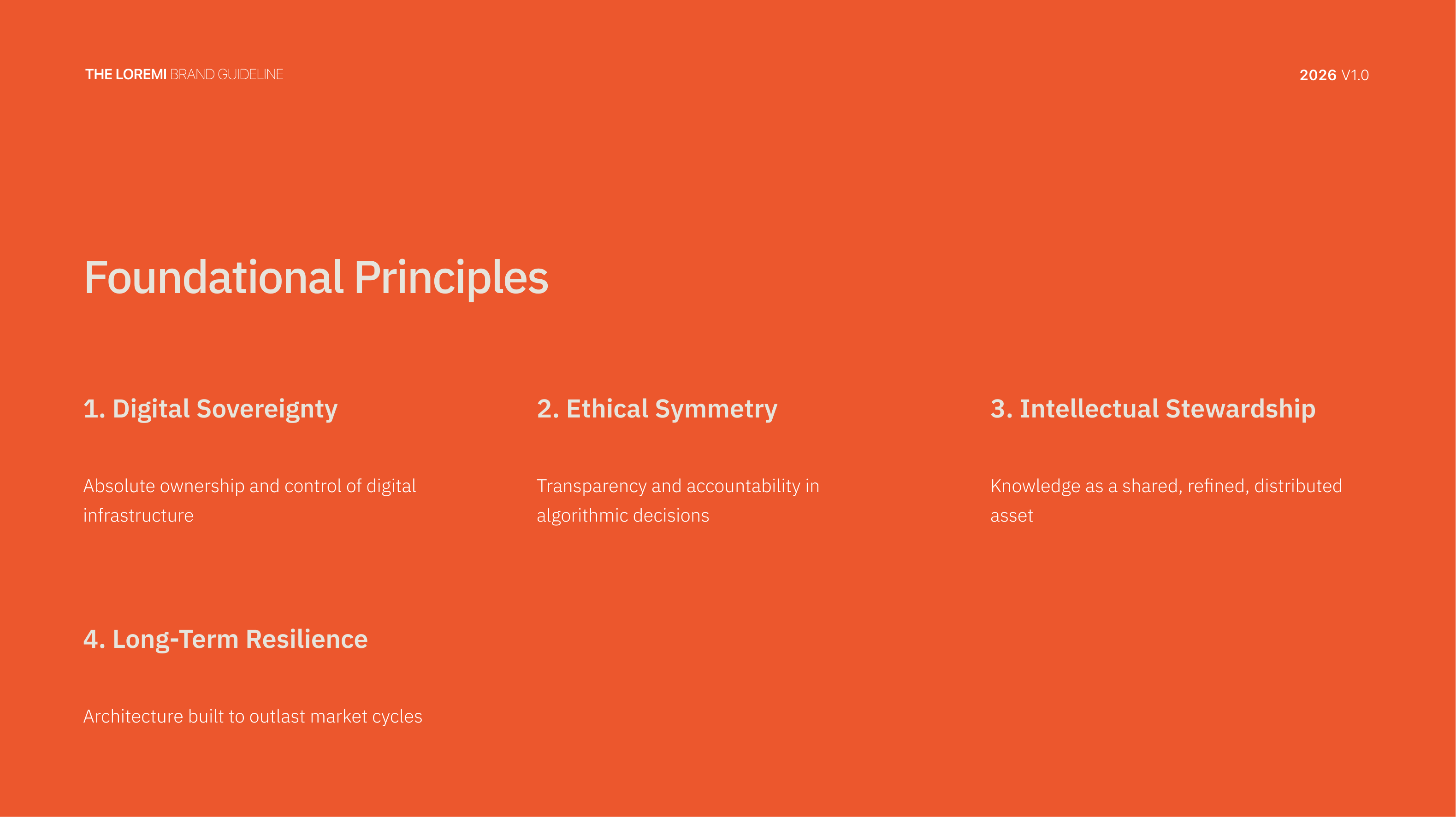
Before a single pixel was drawn, we worked through the brand's mission, vision, core values, and foundational principles. The Loremi stands for true ownership of digital systems — where control stays with the user, not the platform. We codified four foundational principles and built a voice framework around a single tonal idea: intellectual, futuristic, and quietly authoritative.
- Brand mission, vision, and core values framework
- Four foundational principles: Digital Sovereignty, Ethical Symmetry, Intellectual Generativity, Long-Term Resilience
- Brand voice and tone built around a single tonal idea: intellectual, futuristic, quietly authoritative
- Positioning statement: 'We think in systems, we speak with precision, and we operate at a level beyond conventional digital services'
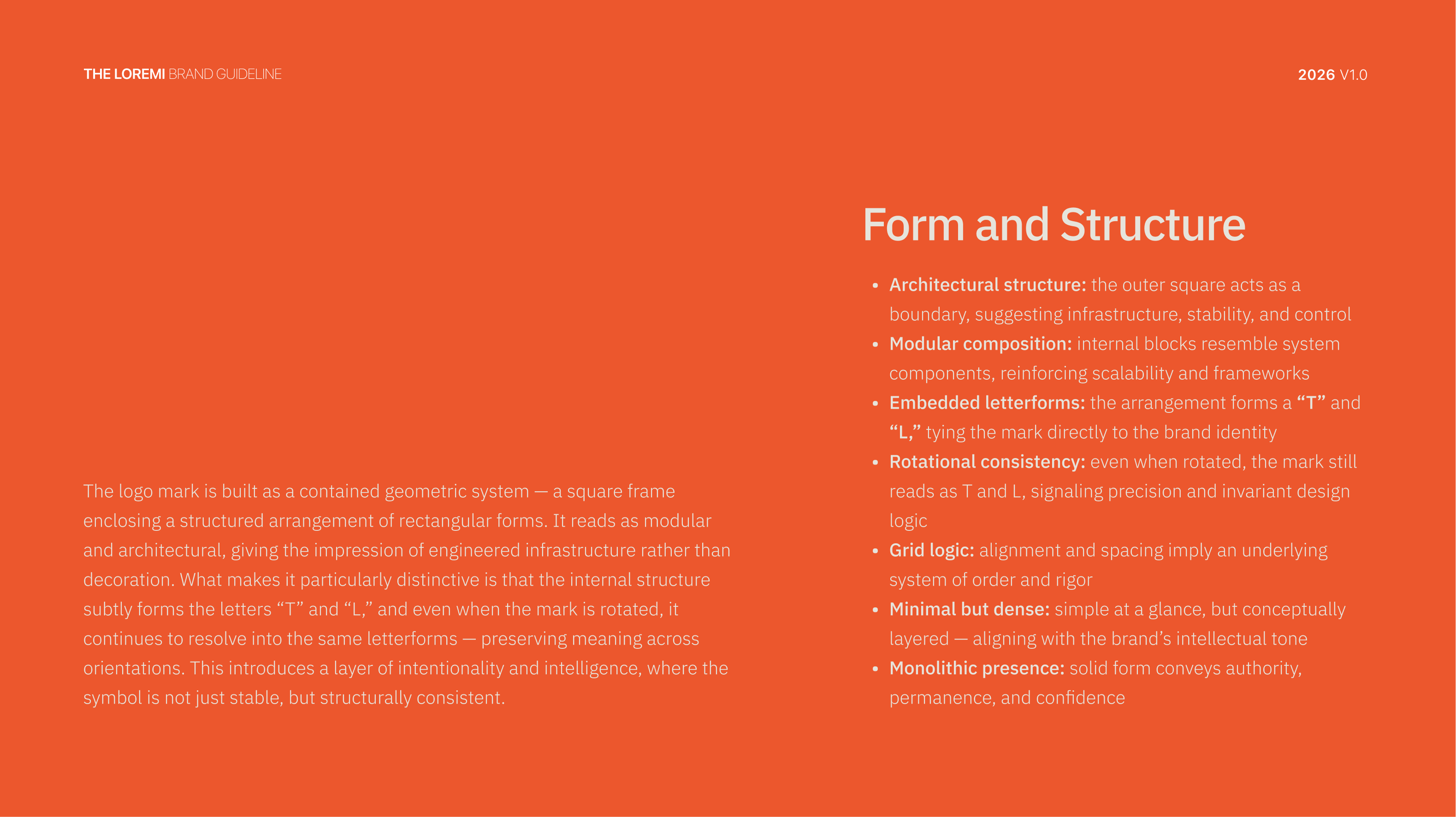
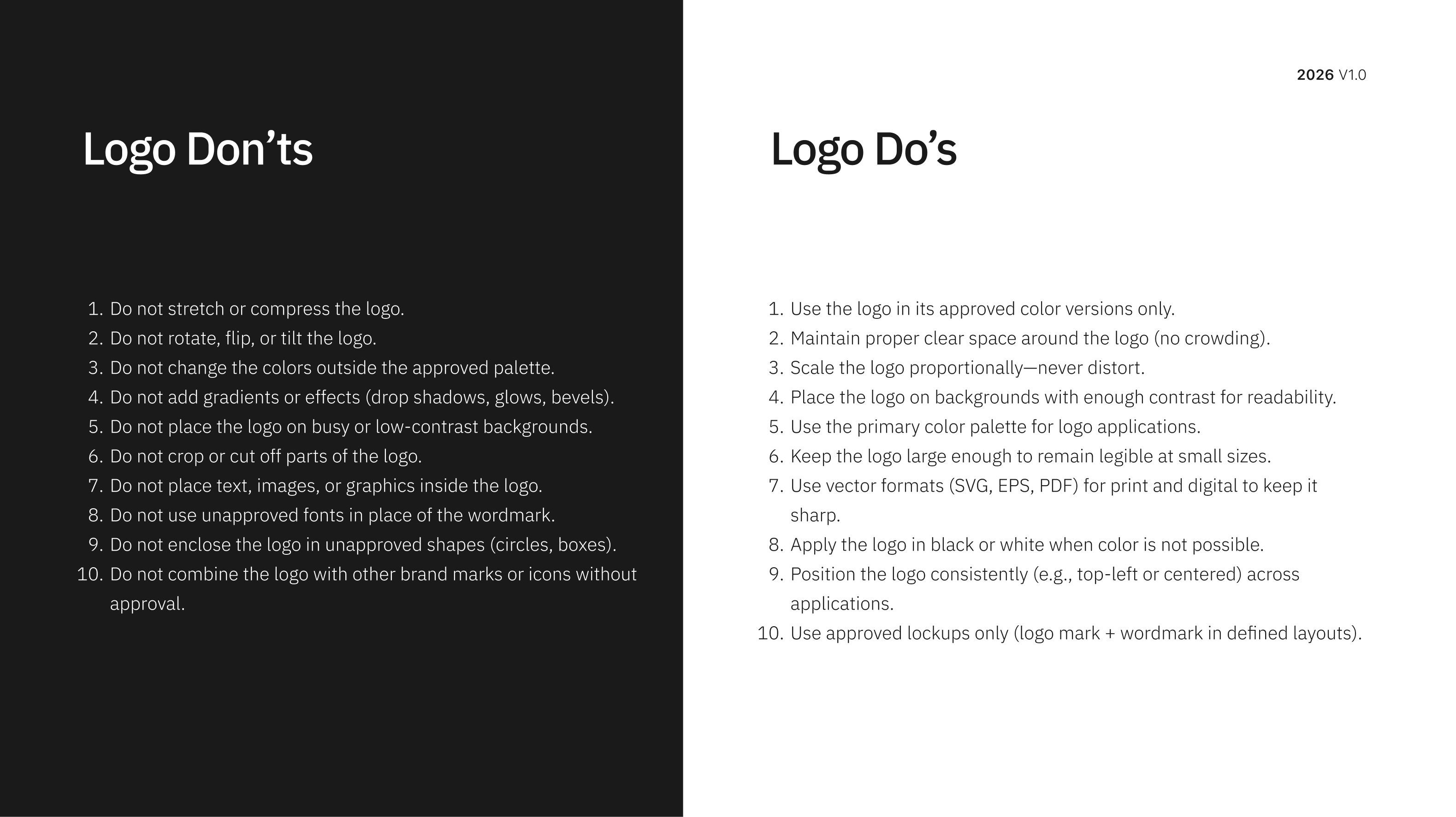
The Loremi mark is a wordmark-meets-monogram system built on a precise engineering grid. The 'TL' lockup carries the weight; the full 'THE LOREMI' wordmark carries the formality. Every angle and proportion is engineered — it reads with equal clarity at a 16px favicon or billboard scale, across three disciplined states.
- TL monogram and full 'THE LOREMI' wordmark system with multiple lockups
- Precision grid construction — every angle and proportion engineered
- Three identity states: full colour, orange knockout, disciplined greyscale
- Clear space rules, do's and don'ts, minimum size specifications for every deployment
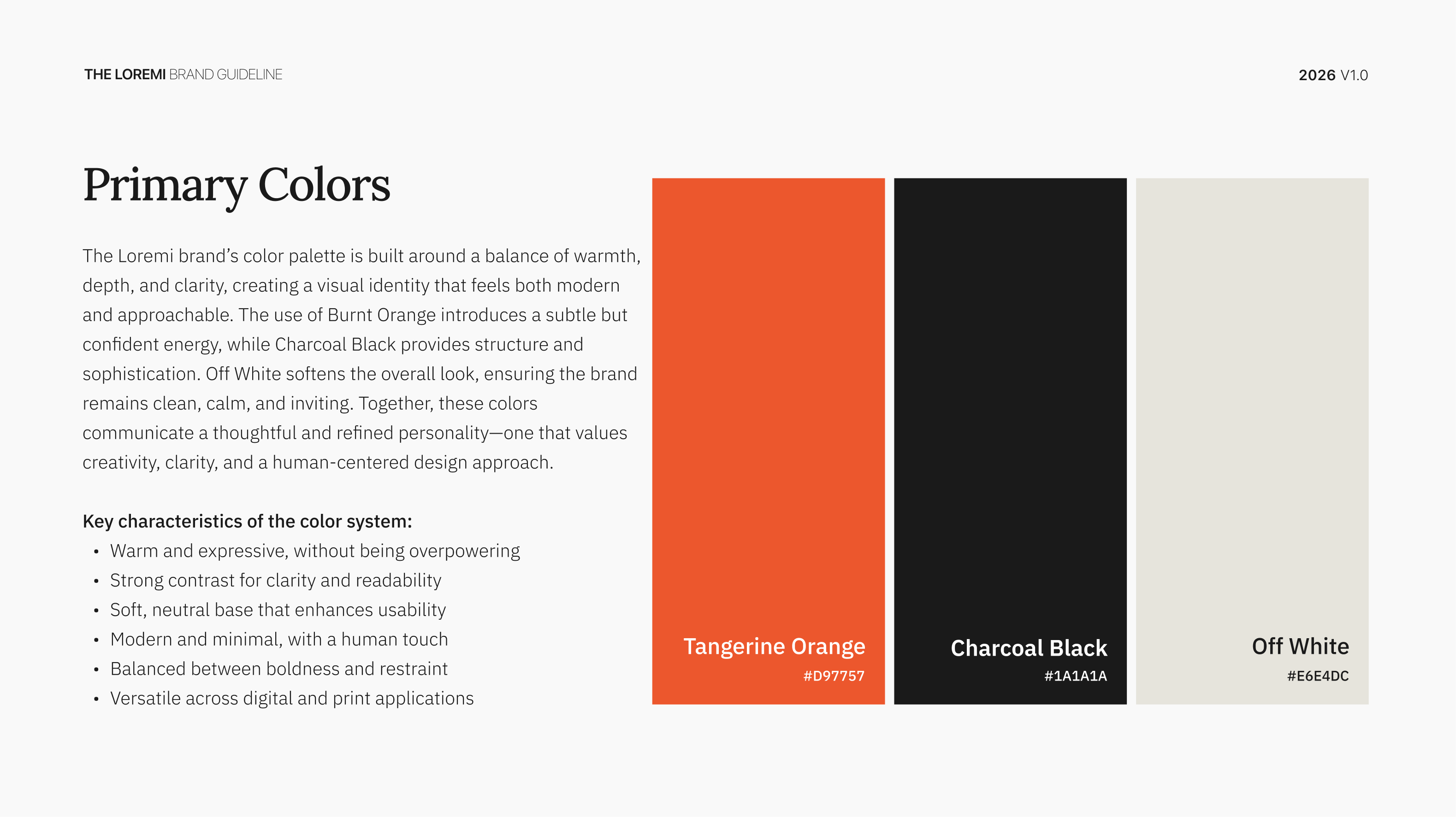
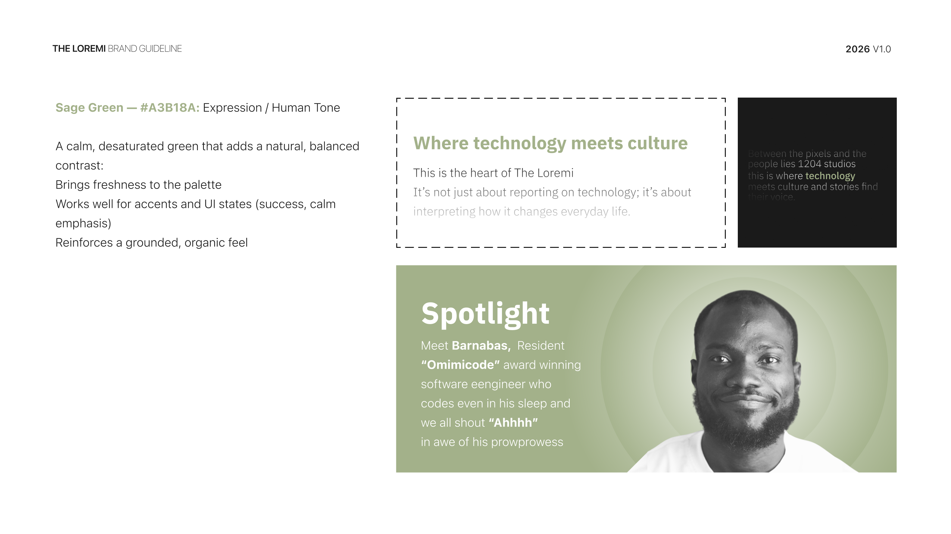
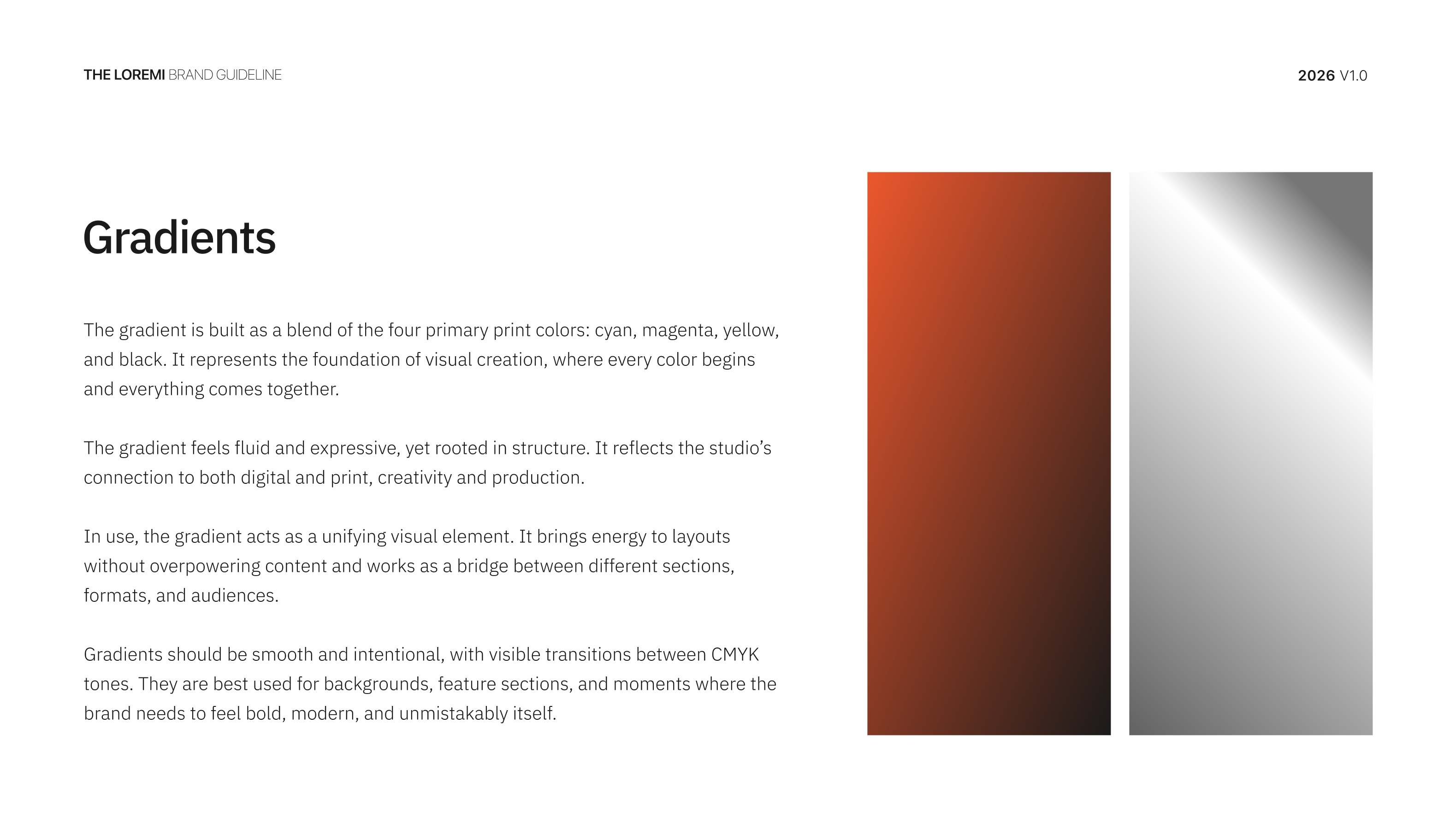
The Loremi palette is engineered, not decorated. Tangerine Orange is the brand's signal colour — loud where it needs to be, restrained where it doesn't. A complete tint system across orange and black governs hierarchy, while a secondary palette of muted terracotta, sage, dusty rose, and steel blue handles editorial and storytelling contexts. The system holds under pressure — stress-tested across UI, editorial, social, and physical applications.
- Primary palette: Tangerine Orange, Charcoal Black, Off White
- Full tint system across orange and black for hierarchy management
- Secondary palette — muted terracotta, sage, dusty rose, steel blue — for editorial contexts
- Stress-tested across UI mockups, editorial layouts, social media, and physical applications
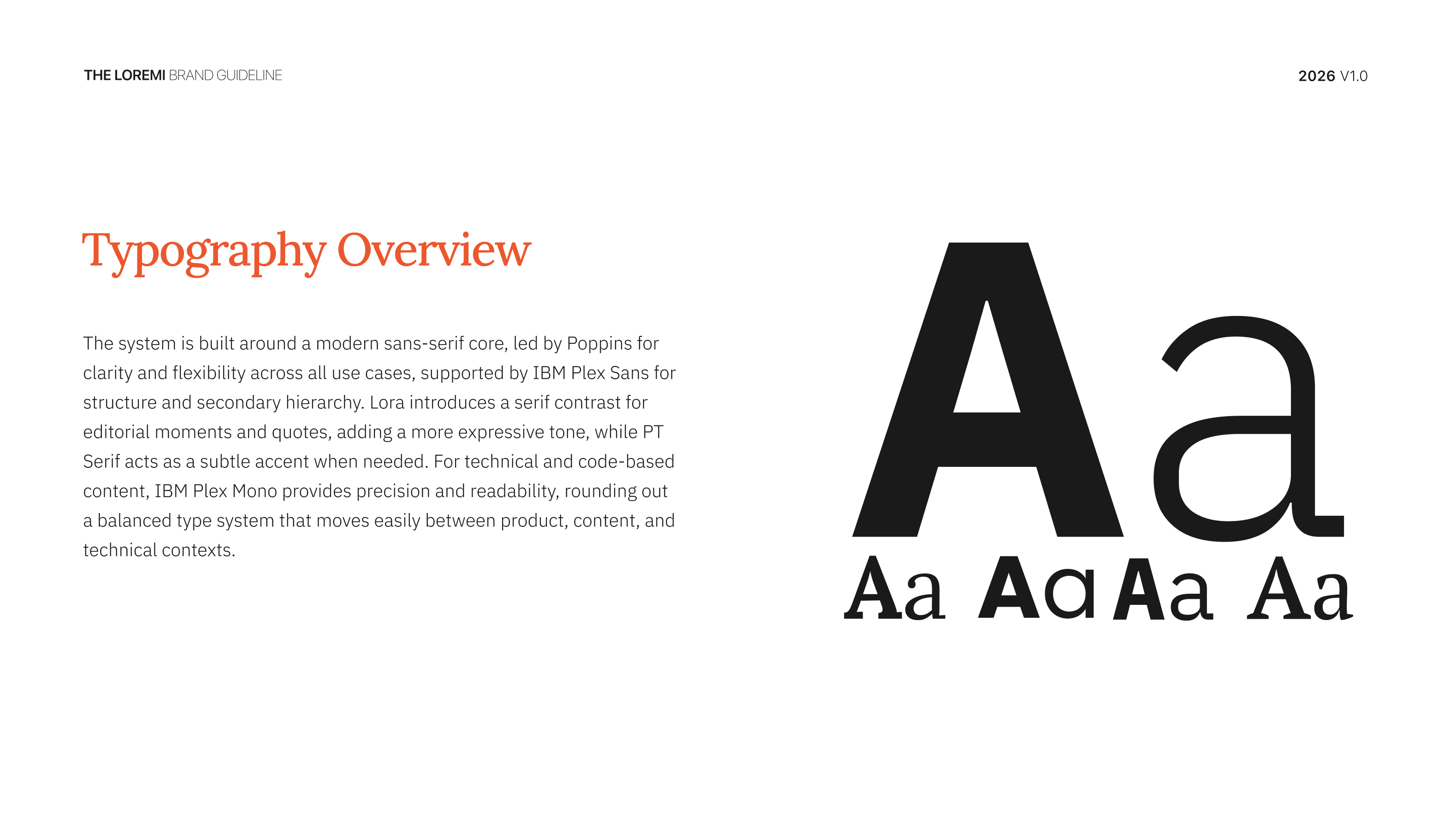
Typography in the Loremi system is treated as architecture. We assembled a five-typeface system, each with a defined role — from IBM Plex Sans as the digital core workhorse, to PT Serif Italic for emphatic pull-quote moments. The hierarchy is governed by explicit stylistic rules for line spacing, letter spacing, and readability, so anything produced under the brand reads as the brand regardless of who made it.
- IBM Plex Sans — The Digital Core: headlines, UI, body, all precision applications
- Poppins for geometric warmth, Lora for long-form editorial, IBM Plex Mono for technical signalling
- PT Serif Italic for pull quotes and emphatic moments
- Explicit stylistic rules for line spacing, letter spacing, and readability thresholds across every context
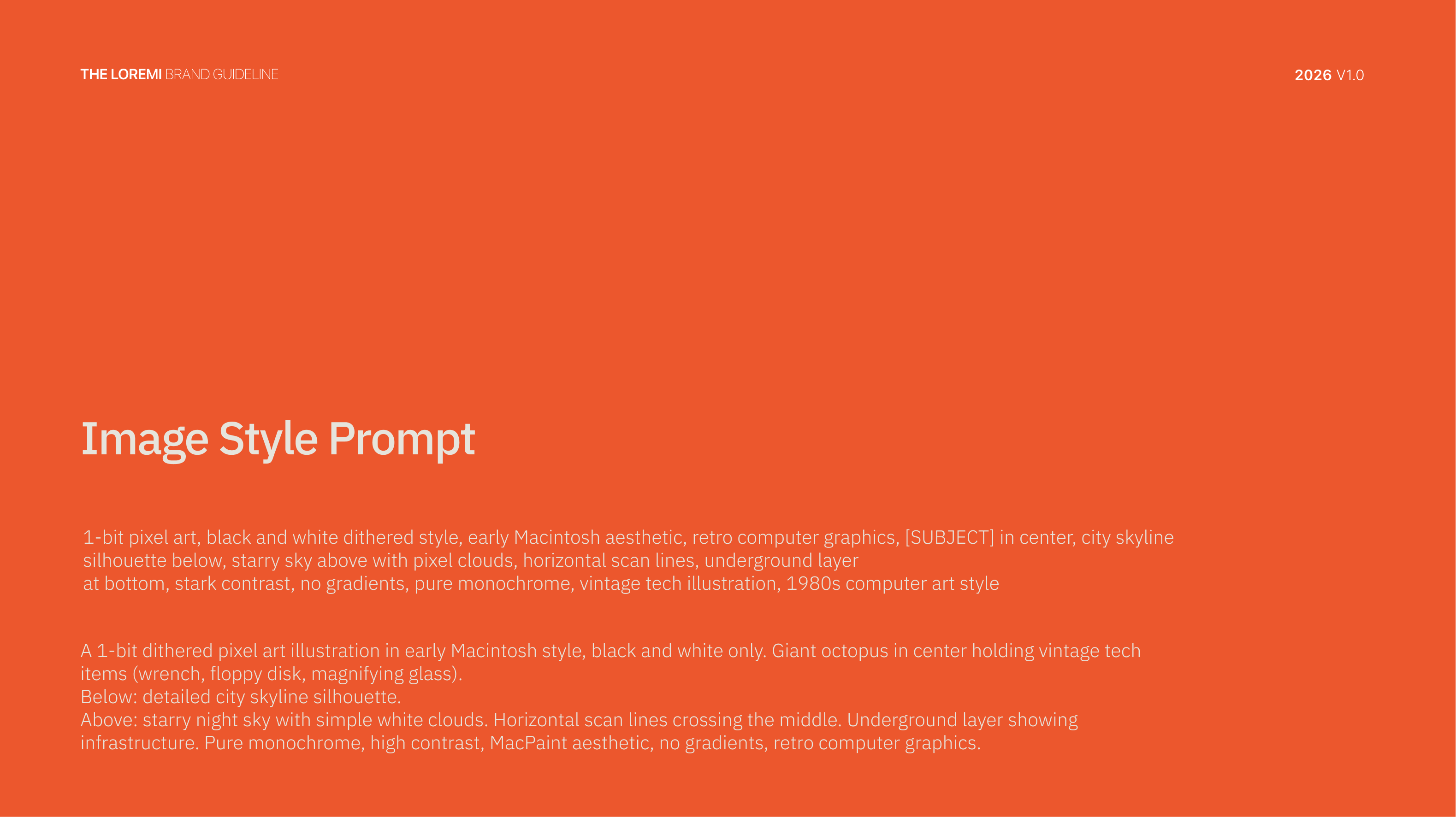
This is where most identity systems run out of road. We built a ten-component visual language — a kit of parts that gives The Loremi an instantly recognisable presence across any surface, in the hands of any designer, on any deadline. From engineered gradient falls to custom data visualisation elements, every component is documented and reproducible.
- Visual overlays, the 'TL' tile pattern system, and a geometric shapes vocabulary
- Stickers & labels, engineered orange-to-black gradient falls, light effects & glows
- Data visualisation elements styled to brand specifications
- UI accent elements, photography masking rules, and noise & texture layers for analog warmth
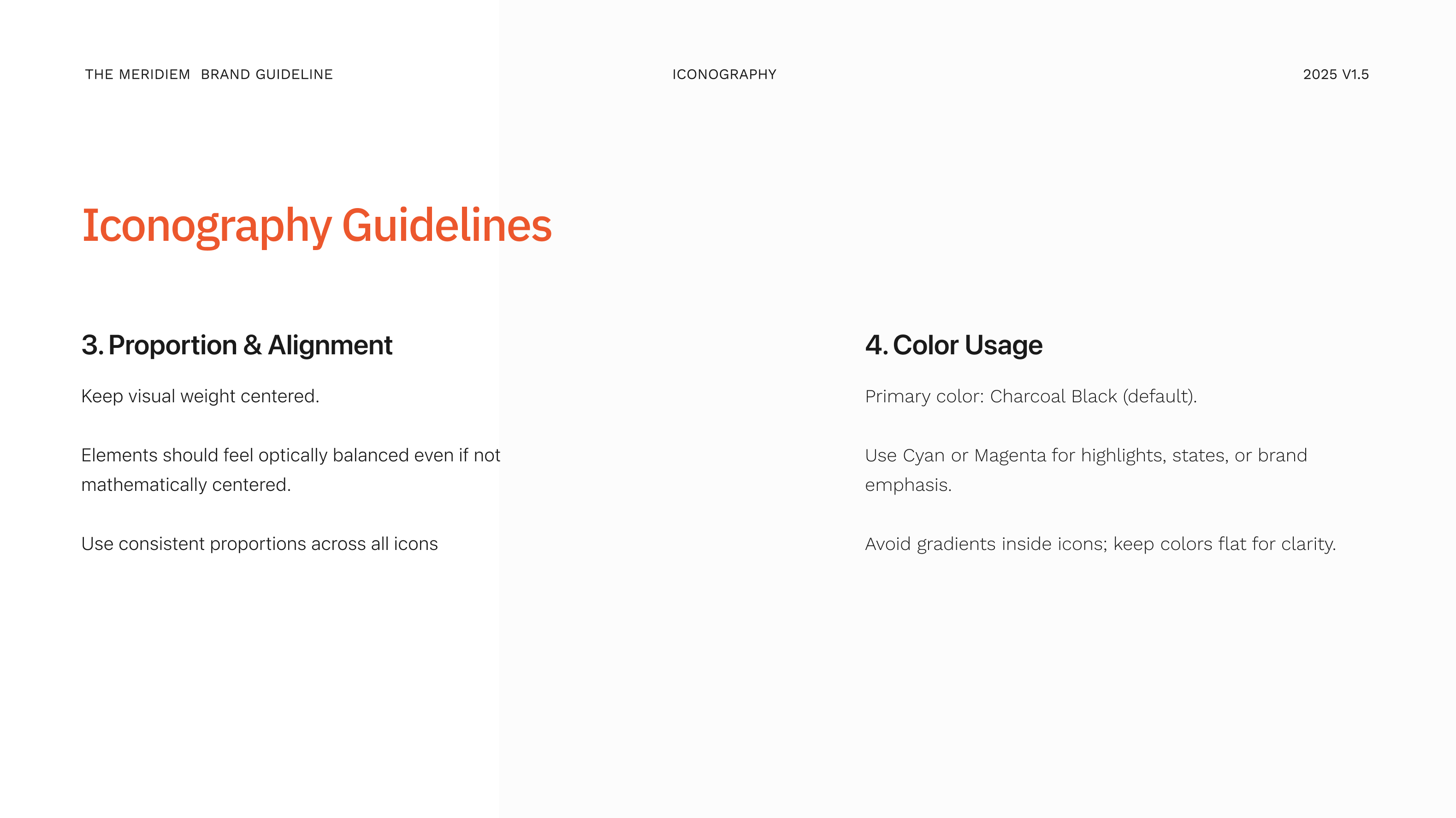
We didn't license an icon pack. We built one. The Loremi iconography is a custom-drawn pixel construction system — designed on a fixed grid, governed by explicit rules for stroke, proportion, alignment, line, scale, state, and animation. Every icon in the family is built from the same atomic units, so the system grows without ever losing coherence.
- 60+ custom pixel icons built on a fixed construction grid
- Governed by explicit rules: stroke, proportion, alignment, line, scale, state, animation
- Three icon states: dark, orange, and variant families
- Full iconography guidelines across six categories — from product UI to social storytelling
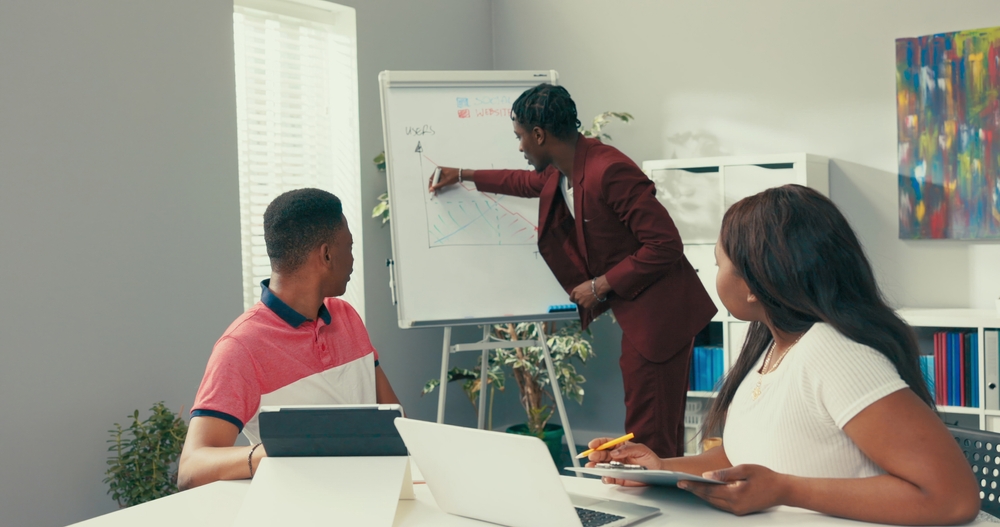
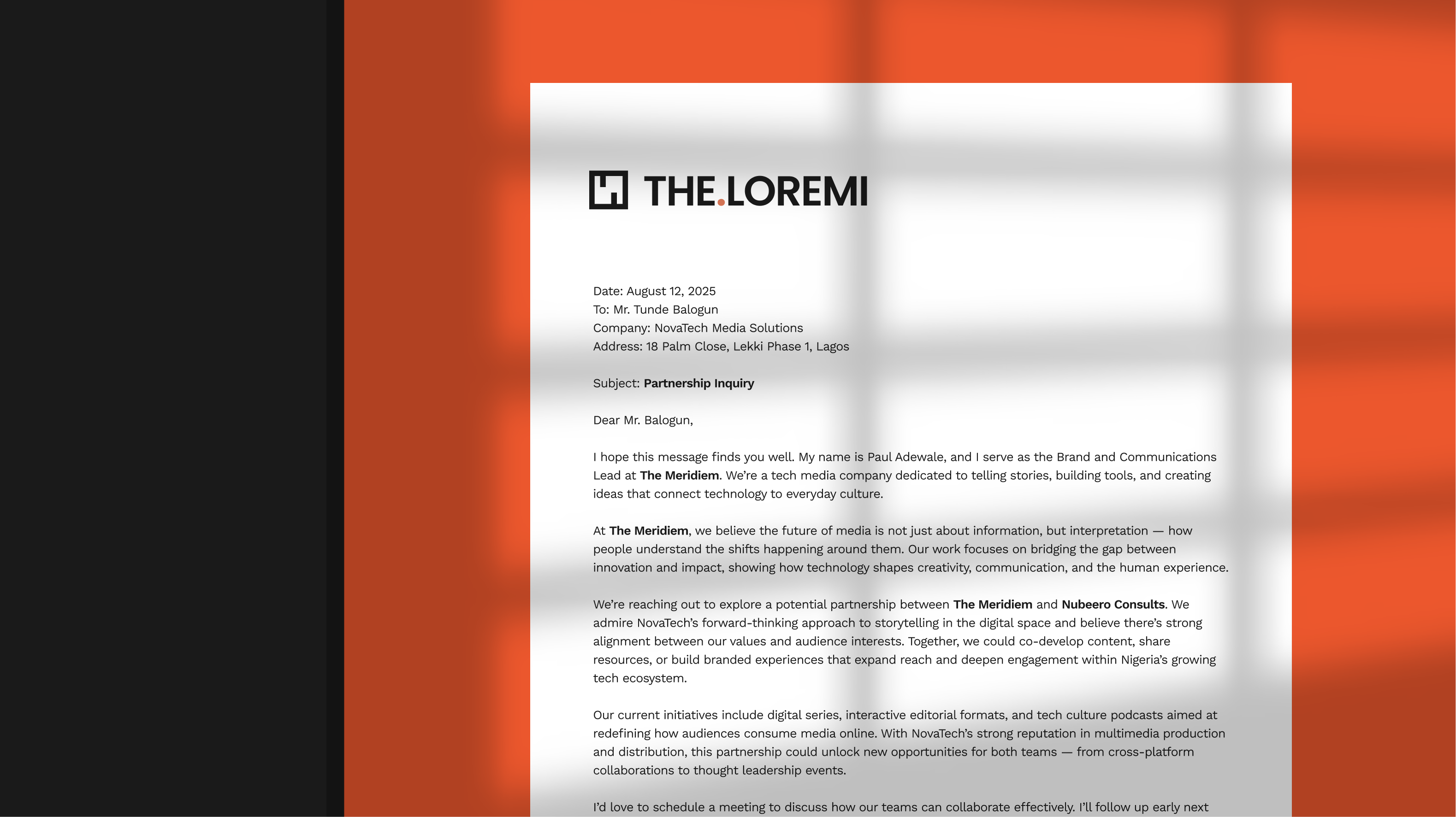
A brand isn't its logo. A brand is the thousandth time someone sees it. We built an applied art direction system that defines how The Loremi shows up across every owned channel — with templates for each surface so nothing is left to interpretation.
- Illustrations, doodles, and a warm hand-drawn counterweight to the technical core
- Social media: feed posts, story templates, reels cover frames
- Identity cards, display pictures, and email signatures across the team
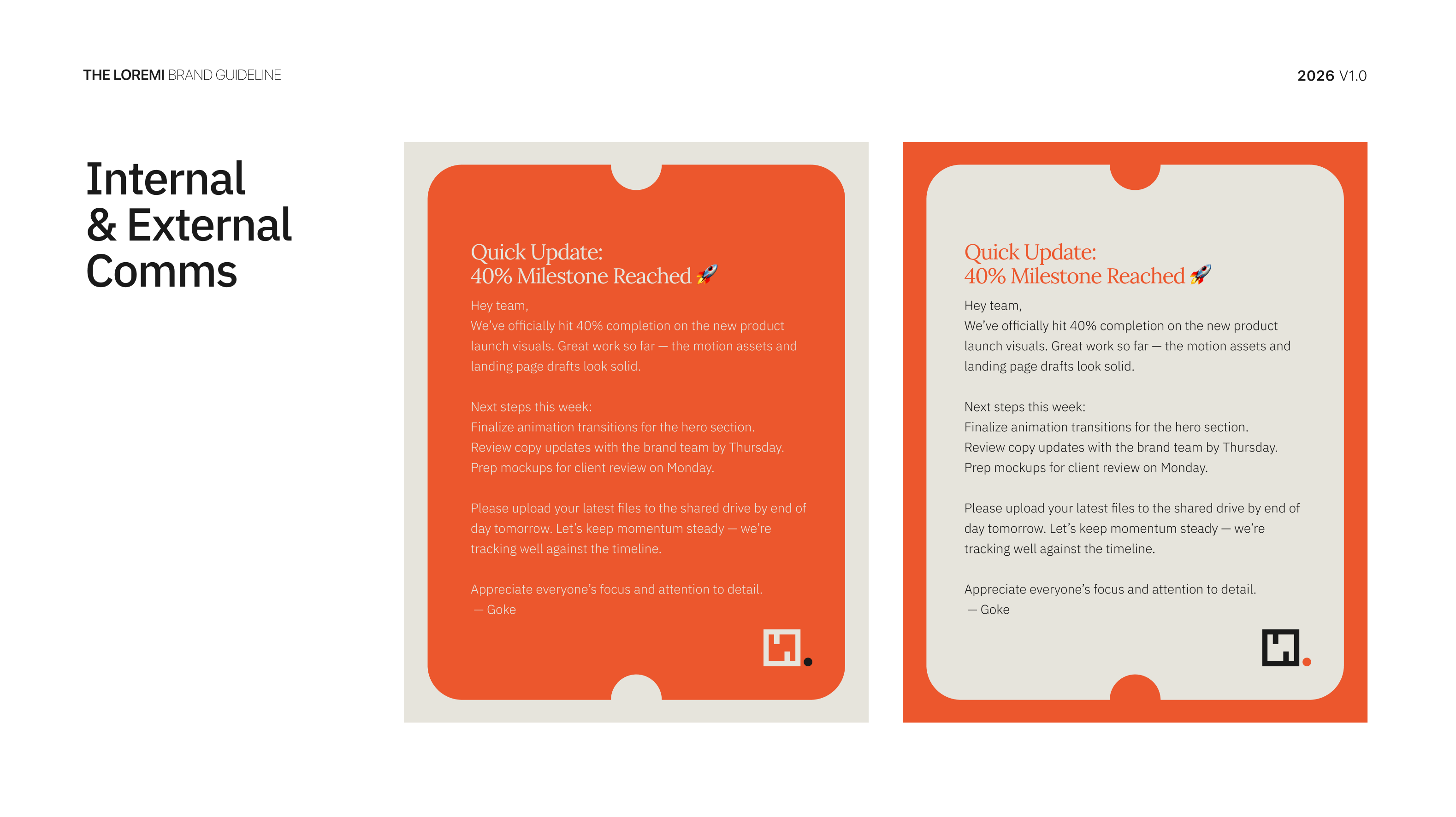
- Landing pages, internal and external communications, newsletter editorial layout system
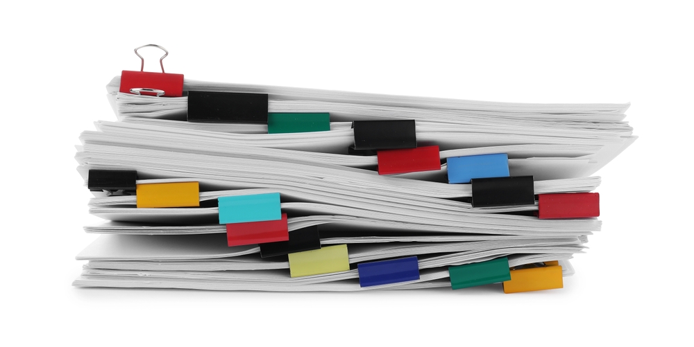
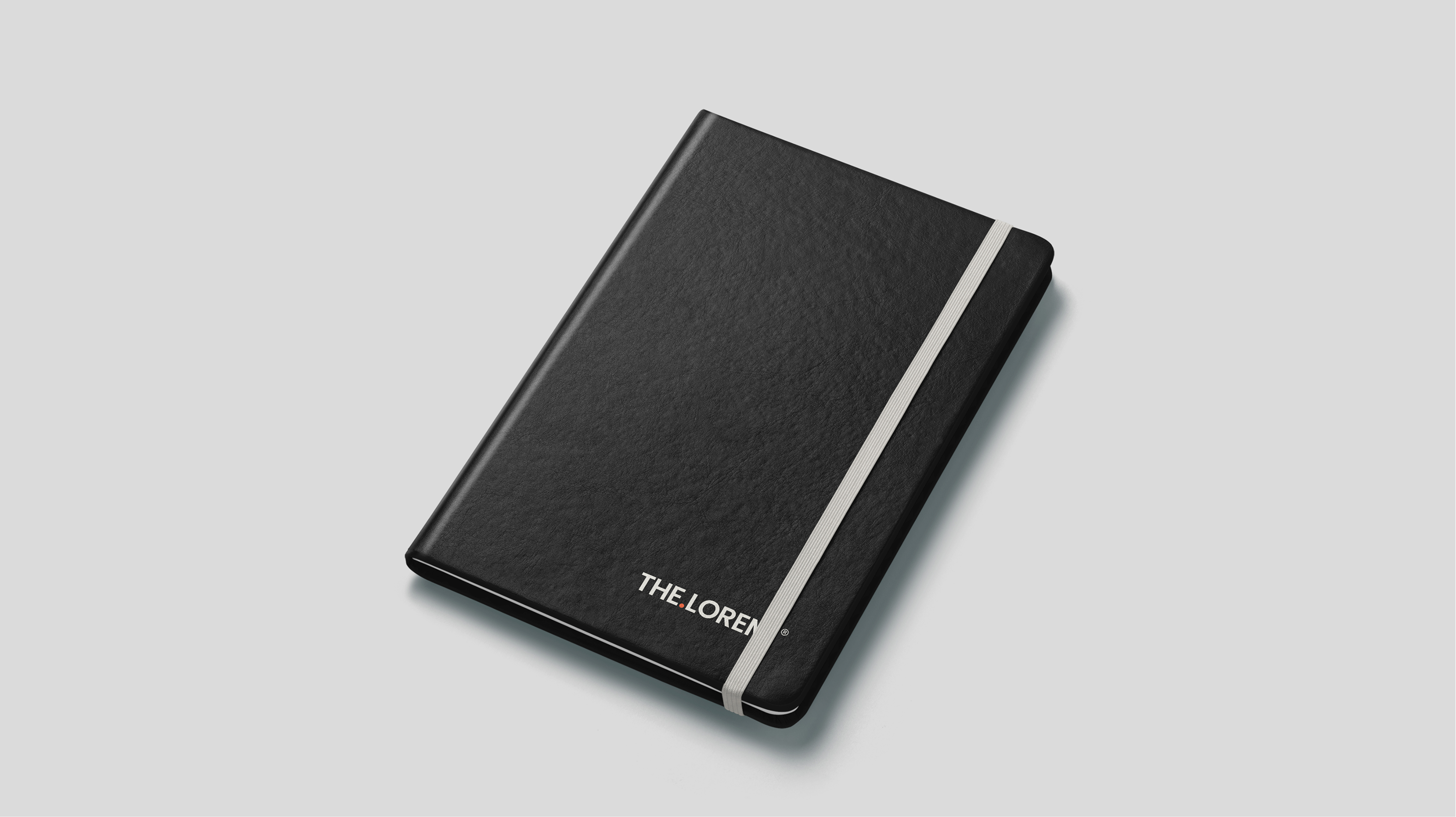
A brand earns its keep in the physical world. We extended the system into a full memorabilia and brand-application suite — every piece designed, mocked up, and ready for production. The brief at every touchpoint was the same: the mark should feel earned, not applied. Restraint is the brand.
- Website landing page system in browser context
- Notebook, jacket, mug, mousepad, t-shirt, tote bag, water bottle
- Document templates: branded letterheads and report covers
- Every piece designed, mocked up, and ready for production
The Loremi launched with a brand system that does what most enterprise brands never manage: it feels considered at every level, from the strategic foundation to the seam on a tote bag.
- A complete brand strategy and voice framework — foundational principles, personality architecture, and a tonal identity the team can operate independently
- A logo system with multiple lockups, three identity states, and explicit usage rules for every deployment context
- A full primary and secondary colour system with tints, stress-tested across UI, editorial, social, and physical applications
- A five-typeface typographic architecture with explicit rules for hierarchy, spacing, and readability at every scale
- A ten-component visual language kit — overlays, patterns, shapes, gradients, glows, data visuals, textures, and more
- A custom 60+ icon library with full construction guidelines and six guideline categories
- A full applied art direction system across ten owned channels, each with reproducible templates
- A complete memorabilia and applications suite ready for production
View all projects
Back to Portfolio