
How we built a trusted healthcare brand that turns patients into partners.
Proben Medical Consult isn't just another clinic — it's precision healthcare built around people. Covering everything from routine check-ups to complex in-depth consultations, Proben exists at the exact intersection of cutting-edge medical knowledge and genuine human connection.
Founded in 2016 and headquartered in Phoenix, Arizona, Proben set out to do what too few healthcare providers do properly: treat the whole person, not just the symptoms. Their guiding belief — that great care starts with genuine connection — isn't a tagline. It's the operating system behind everything they do.
Since opening, Proben has become a trusted cornerstone of Phoenix's healthcare community, empowering individuals with the knowledge, resources, and partnership they need to navigate health and wellness on their own terms.
Proben had nearly a decade of real clinical work behind them. What they didn't have was a brand that reflected it. We were brought in to close that gap across five fronts — simultaneously.
- No cohesive visual language, no typography system, no identity that could immediately signal warmth, professionalism, and trust to someone searching for a medical consult in an unfamiliar city.
- A healthcare provider without a strong website is a referral waiting to get lost. Proben needed a clean, credible, and conversion-focused digital platform — one that guided prospective patients from curiosity to booked appointment with minimal friction.
- Proben's team had deep medical expertise and genuine stories to tell. But without a structured content approach, that expertise stayed locked inside the clinic walls instead of building authority online.
- No channels, no community, no voice in the conversations their target patients were already having — from wellness forums to local Phoenix health communities.
- Credible to long-term Phoenix residents. Accessible to newcomers and underserved communities. Authoritative enough for referral partners and insurers — all without diluting the brand's core warmth and humanity.
- A quiet healthcare launch is a missed opportunity. Proben needed a campaign that put them in front of the right people — patients, partners, and community stakeholders — and gave the brand a first impression worth remembering.
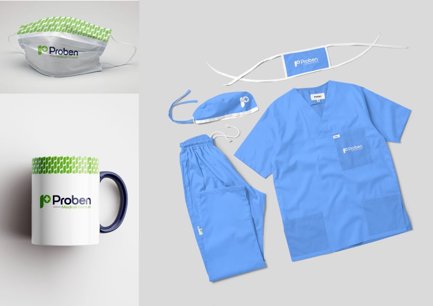
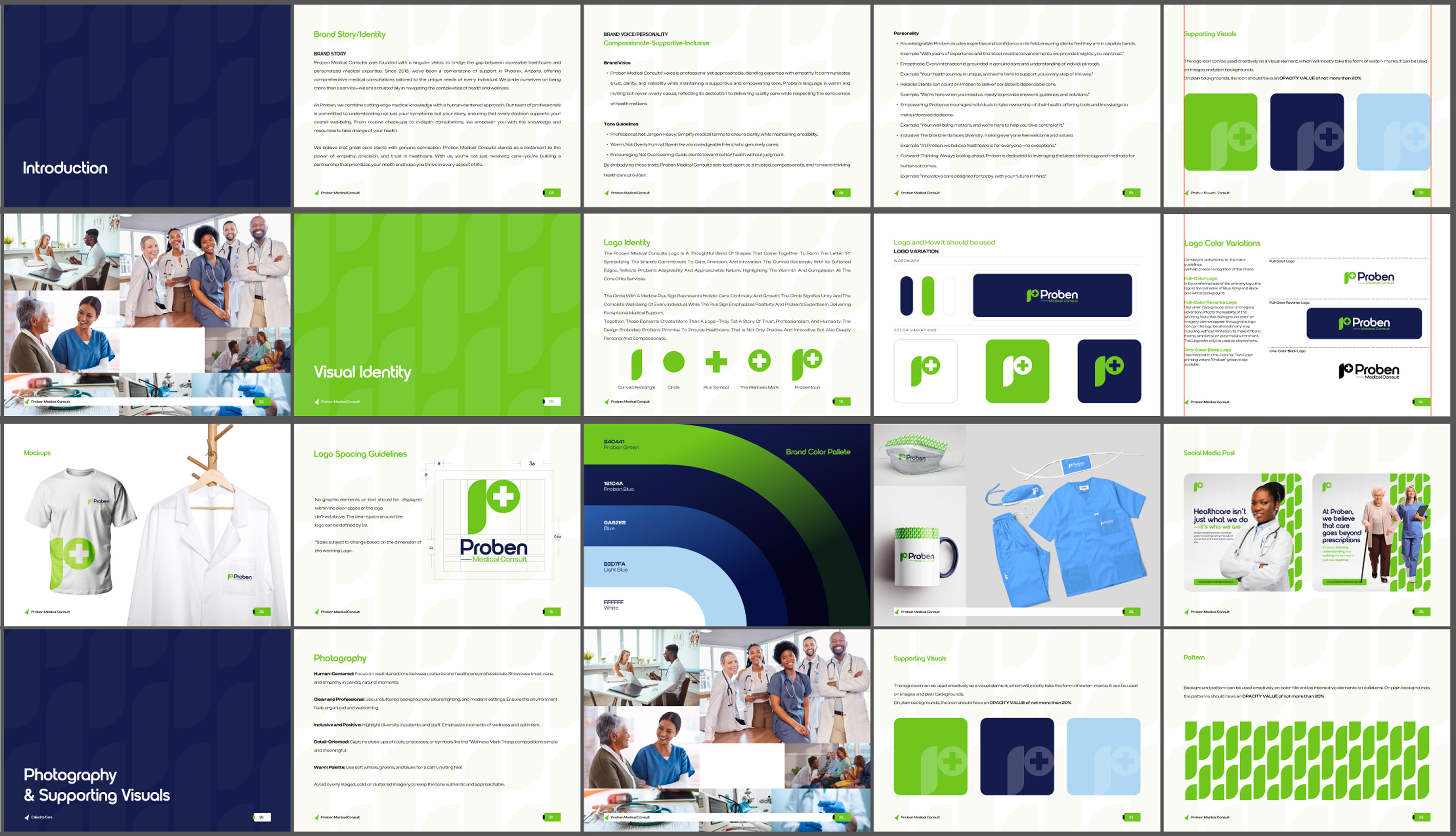
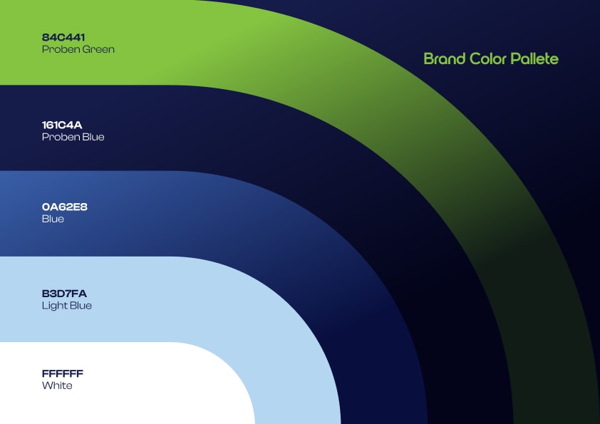
We developed a full visual identity for Proben Medical Consult — one that felt professional and clinically credible without feeling cold or corporate. Clean typographic hierarchy, a warm but authoritative colour palette, and an identity system built to scale across digital, print, and in-clinic touchpoints.
- Logo design and wordmark system
- Typography and colour framework
- Brand voice and tone guidelines rooted in empathy and precision
- Design system for consistent visual storytelling across all patient-facing materials
We designed and built a full-service website — fast, accessible, and built to convert. Every design decision was made with the prospective patient in mind: clear navigation, mobile-first layouts, and page architecture that maps directly to how people make healthcare decisions online.
- Full UX/UI design for desktop and mobile
- Service page architecture (Consultations, Specialties, About, Contact)
- Appointment booking integration and contact flow optimisation
- SEO-optimised page templates and local search strategy for Phoenix
Medical expertise without a content strategy is a missed opportunity to build trust at scale. We mapped out Proben's content pillars, editorial cadence, and distribution playbook — so every blog post, FAQ, and social caption had a purpose and a path to the right reader.
- Editorial content pillar framework (Preventive Care, Wellness, Patient Education, Community)
- Audience persona mapping for Phoenix-area patients
- Content calendar and publishing cadence
- Newsletter strategy for ongoing patient engagement and retention
We built Proben's social presence from zero — setting up channels, developing platform-specific content formats, and creating a social voice that mirrors the brand's clinical authority while remaining approachable and community-rooted.
- Channel setup and profile optimisation across key platforms
- Social content templates and format guide
- Community engagement and local growth strategy
- Analytics tracking and performance benchmarks
We designed and executed a launch campaign built to make noise in the right rooms — and the right neighborhoods. The goal wasn't just reach. It was to put Proben in front of the exact patients, referral partners, and community organisations who would become long-term advocates from day one.
- Launch campaign concept and creative direction
- Targeted paid and organic local distribution strategy (Phoenix-focused)
- Outreach to local health networks, community organisations, and referral partners
- Launch week content and social activation plan
Proben launched with the kind of brand confidence that most healthcare providers spend years trying to establish. But the numbers only tell part of the story. What we really built was trust infrastructure — the kind that turns a first-time patient into a long-term partner.
- Full visual identity system — logo, typography, colour, and voice guidelines delivered across every patient-facing touchpoint
- Conversion-ready website built for mobile-first healthcare decision-making, with booking flow and local SEO from day one
- 5 services delivered at launch — brand, web, content, social, and campaign — giving Proben a complete growth infrastructure
- Zero brand drift — a guidelines document the team can use independently without returning to an agency for every asset






View all projects
Back to Portfolio