The shape of care is connection.
Autism care rarely begins in a clinic. It begins at home.
It starts with a parent noticing that something feels different. A delayed milestone. A missing response. A quiet concern that slowly grows louder. What follows is often a journey filled with uncertainty, conflicting information, long waiting lists, inconsistent access to specialists, and support systems that rarely speak to one another.
For millions of families around the world, the greatest challenge isn't simply receiving a diagnosis. It's knowing what to do next.
Today, autism affects approximately one in 36 children in the United States and an estimated one in 100 people globally. Yet access to early screening, quality information, and ongoing support remains deeply unequal. Women and girls continue to be underdiagnosed. Minority communities are frequently overlooked. Families in low-resource settings often have little or no access to specialists altogether.
Neuvia exists because care should never depend on geography, privilege, or proximity.
Built around the promise "Bridging concern to care," Neuvia creates continuity where the system often creates gaps. Through Neuvia Wellness, families receive self-check tools, educational resources, caregiver training, and practical guidance for everyday life. Through Neuvia Clinical, healthcare professionals gain access to evidence-aligned decision support built around recognised clinical standards. Together, these two experiences create a connected ecosystem that supports families from their very first questions through every stage that follows.
Our role was to create an identity that could express this ambition. One that felt reassuring without becoming sentimental, clinically credible without feeling institutional, and hopeful without ignoring the complexity of the journey.
Healthcare brands often communicate expertise.
Family brands communicate empathy.
Neuvia needed to communicate both.
The identity had to earn the confidence of clinicians while immediately putting anxious parents at ease. It needed to reflect rigorous, evidence-based thinking without becoming cold or overly medical. Just as importantly, it had to move beyond the visual clichés that have long defined conversations around autism.
The challenge wasn't to design another healthcare company. It was to design a bridge.
A bridge between wellness and clinical care. Between families and professionals. Between concern and clarity. Between communities with abundant resources and those where support remains scarce.
Because Neuvia isn't simply helping people find answers. It is redesigning how answers are reached.
That philosophy became the foundation for every decision we made.
Every great identity begins with a single idea.
For Neuvia, that idea was connection.
The logo is centred around an arc that functions on multiple levels simultaneously. It forms the letter N, anchoring the identity to the brand name, while also representing a bridge — not simply a physical bridge, but a symbolic one. A passage from uncertainty to understanding. From waiting to action. From isolation to support.
Inside this bridge sits a collection of interwoven forms. These shapes deliberately avoid representing autism itself. Instead, they represent the people whose collective effort makes meaningful care possible.
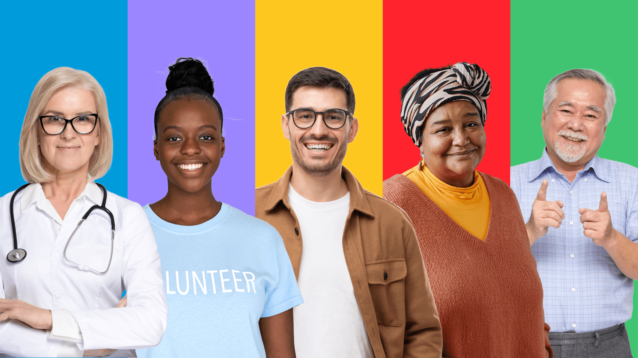
- Blue represents clinicians who bring expertise, diagnosis, and professional guidance.
- Purple recognises support organisations, peer groups, advocates, and professionals who connect families to information and resources.
- Yellow represents caregivers whose patience, routines, and everyday encouragement shape progress in ways clinical interventions alone cannot.
- Red honours families — often the first to notice a difference and the strongest advocates throughout the journey.
- Green celebrates communities, schools, workplaces, and society itself — because inclusion cannot exist without them.
Together, these forms resemble puzzle pieces — not as a reference to outdated symbolism, but as an expression of interconnectedness. Every role depends on another. Every person strengthens the system.
The logo therefore becomes more than an identifier. It becomes a visual model of how Neuvia believes care should work.
We wanted the identity to behave the same way Neuvia delivers care: continuously.
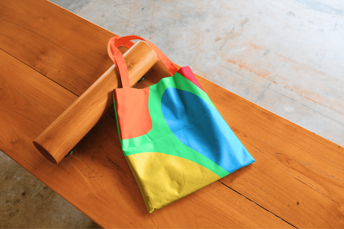
Rather than existing as a single mark, the bridge becomes the organising principle of the entire visual system. Its curves evolve into pathways that guide layouts, create hierarchy, frame information, and connect content across digital and physical touchpoints. The visual language is always moving forward, quietly reinforcing the idea of progress without relying on literal imagery.
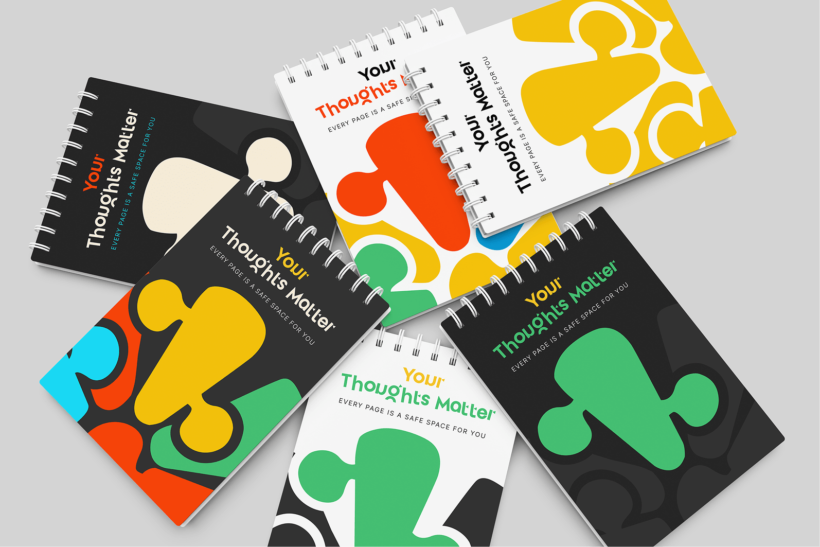
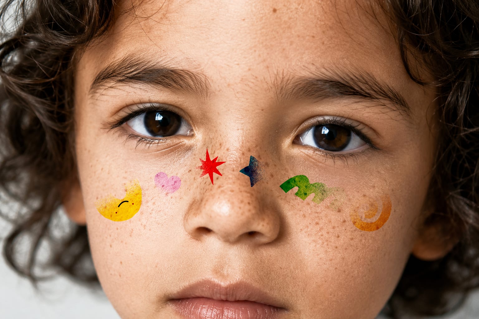
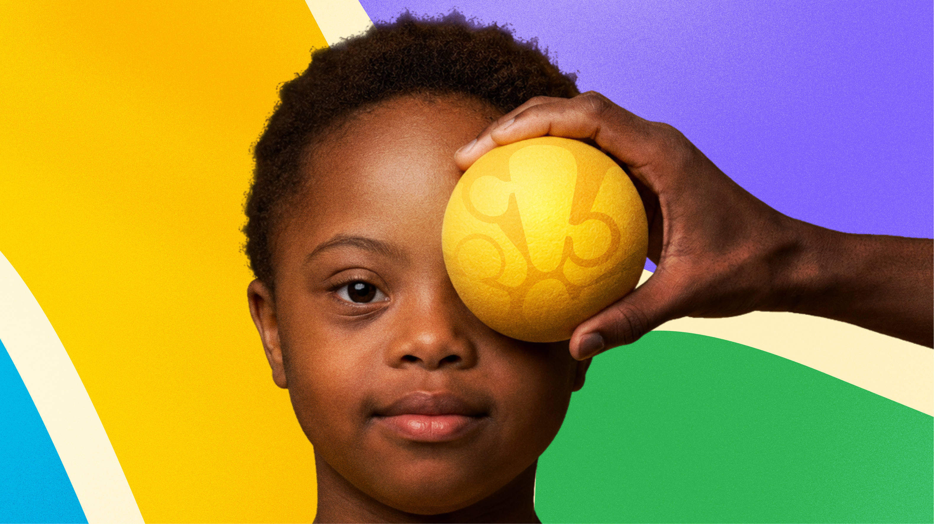
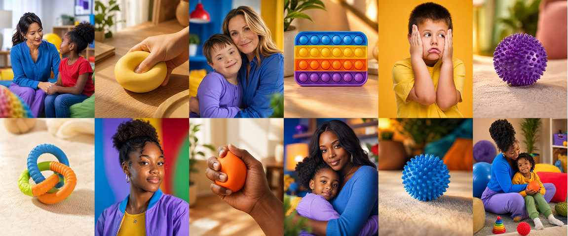
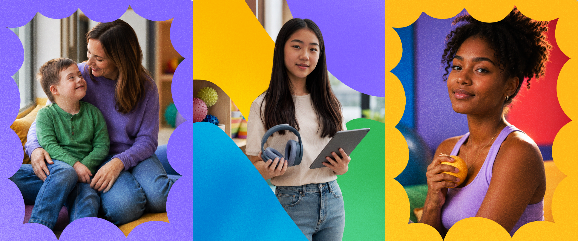
The interlocking forms expand into patterns, illustrations, and graphic devices that can adapt across interfaces, presentations, educational resources, community campaigns, and product experiences. Every composition reinforces collaboration rather than individualism.
This thinking also informed the creation of Nuvy.
Healthcare information can often feel intimidating, particularly for families experiencing autism for the first time. Nuvy exists to soften that experience without trivialising it. Designed as Neuvia's friendly companion, Nuvy carries the same visual DNA as the identity itself — soft curves, rounded forms, approachable expressions, and the brand's colour system allow the character to naturally embody each member of the care ecosystem.
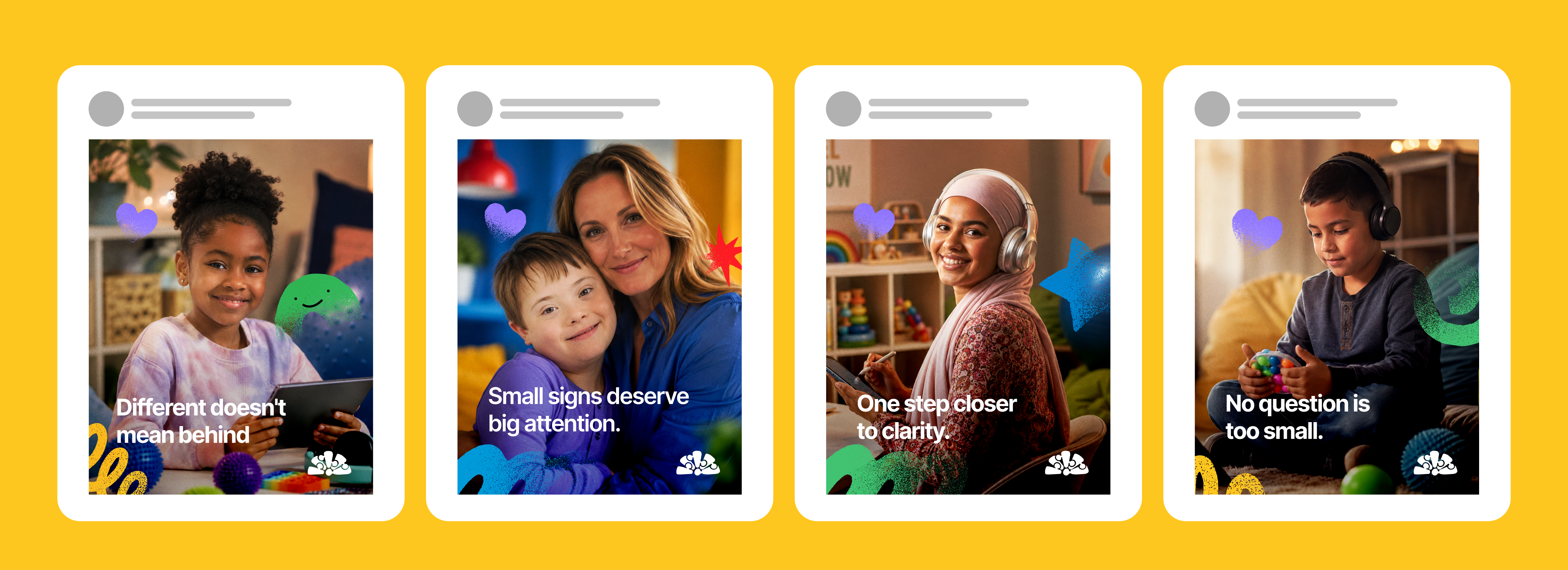
Across the app, educational materials, social media, and community programmes, Nuvy provides reassurance, celebrates progress, and reminds families that they are never navigating the journey alone.
The identity therefore doesn't stop at recognition. It actively participates in care.
Every colour in the Neuvia system carries meaning.
Rather than functioning as decorative accents, the palette was designed as a representation of the people who make equitable autism care possible. Blue, purple, yellow, red, and green each stand for one participant in the journey — creating a visual language where diversity becomes structure rather than symbolism.
Whenever these colours appear together, they reinforce Neuvia's belief that better outcomes emerge through collaboration. No single colour dominates the system, just as no single participant carries the responsibility of care alone.
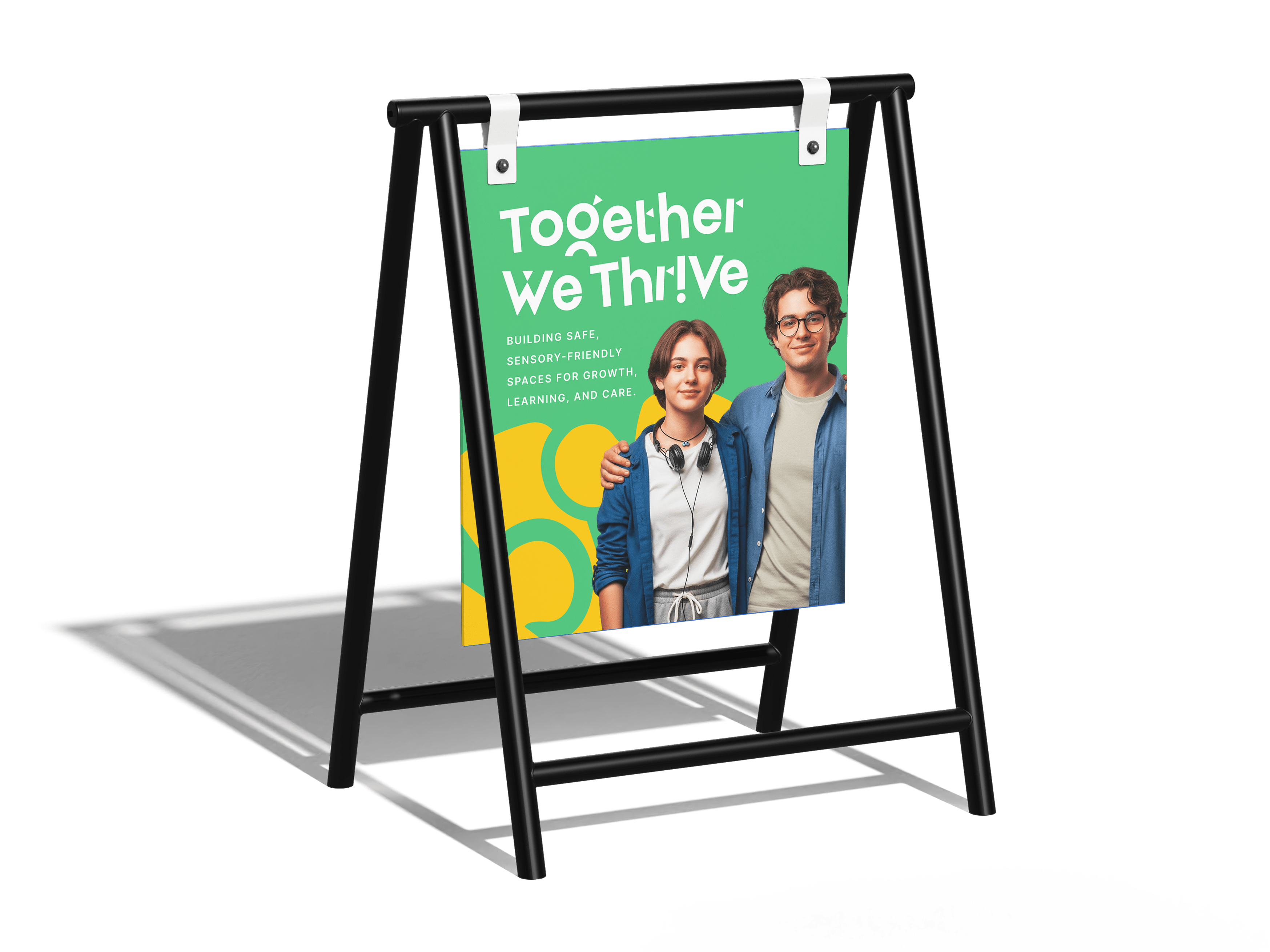
The wordmark extends this philosophy of inclusion. Its letterforms intentionally reject rigid precision in favour of warmth and individuality. Inspired by the varied ways neurodivergent people experience reading and communication, the typography embraces slight irregularities that give the identity humanity and personality.
Rather than correcting difference, it acknowledges and celebrates it.
This subtle imperfection creates something memorable without sacrificing legibility. Every letter feels unique, yet belongs to the same system — echoing Neuvia's vision of diverse people coming together in shared purpose.
Ultimately, the identity is built around the same values that define the organisation itself: equity, compassion, trust, clarity, continuity, collaboration, and accessibility.
It is not simply a brand designed to explain autism. It is a brand designed to make the journey feel less lonely.
Project Team
Okiki Megida, Sodiq Ayilara, Paul Adegoke
Contributors
Deborah Adeniyi, Emmanuel Ayeni
"Honestly, we expected branding to be one of the hardest parts of building Neuvia. It turned out to be one of the easiest. The team understood our vision incredibly quickly and translated it into an identity that feels warm, credible, and unmistakably us."
View all projects
Back to Portfolio