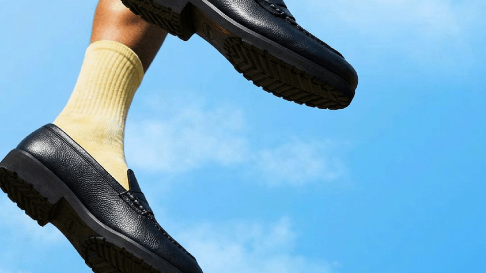
Making every step worth noticing.
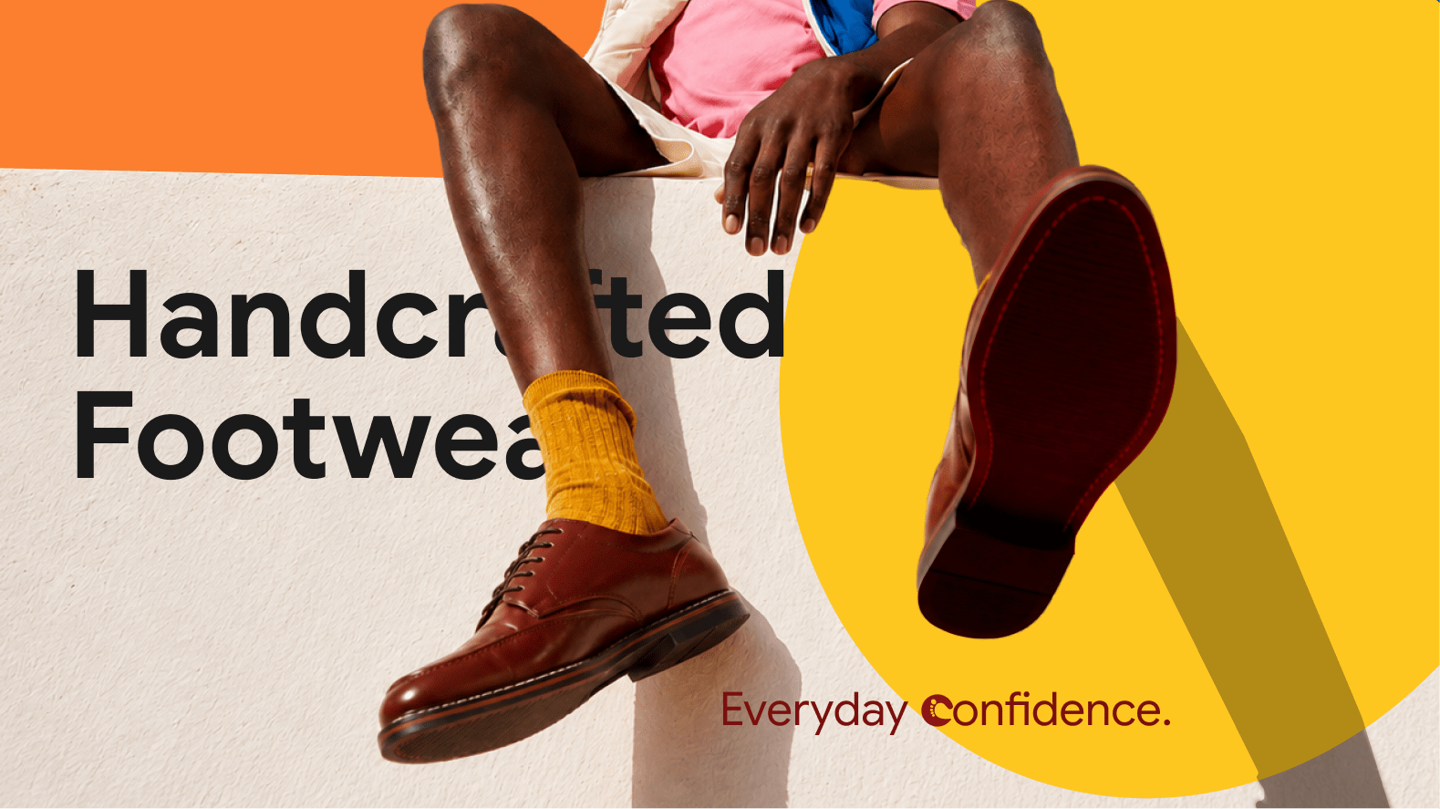
The smallest details often shape the biggest impressions. The shoes beneath every step. The belt that pulls everything together. The finishing touches that rarely demand attention, yet quietly define how confidence is seen and felt.
That belief is what Cresteps was built on. They see footwear and accessories not as the last thing you put on, but as the first thing that shapes how you show up — crafted to elevate presence, inspire confidence, and make every step feel intentional.
Our challenge was to translate that philosophy into a brand identity. One that felt contemporary without chasing trends, premium without creating distance, and quietly confident without ever competing for attention. An identity designed for people who know that when every detail is considered, confidence follows naturally.
Leather brands often fall into one of two extremes. They either lean heavily into heritage, appearing traditional and inaccessible, or pursue modern minimalism so aggressively that they lose warmth, personality, and distinction.
Cresteps needed to occupy the space in between.
The identity had to communicate craftsmanship without feeling old-fashioned. It needed to feel fashionable without becoming disposable. Above all, it had to express movement, because the brand isn't simply about products people wear. It's about the confidence with which they wear them.
The challenge wasn't simply designing another footwear logo or brand system. It was creating a brand that celebrated the everyday act of taking a step, and everything that step communicates before a single word is spoken.
That meant creating an identity that felt premium without pretence, contemporary without chasing trends, and memorable enough to live far beyond a shoe box.
We built the identity around the one thing every Cresteps product shares: Movement.
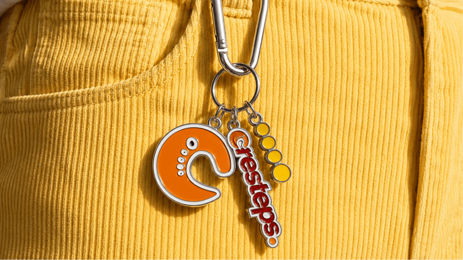
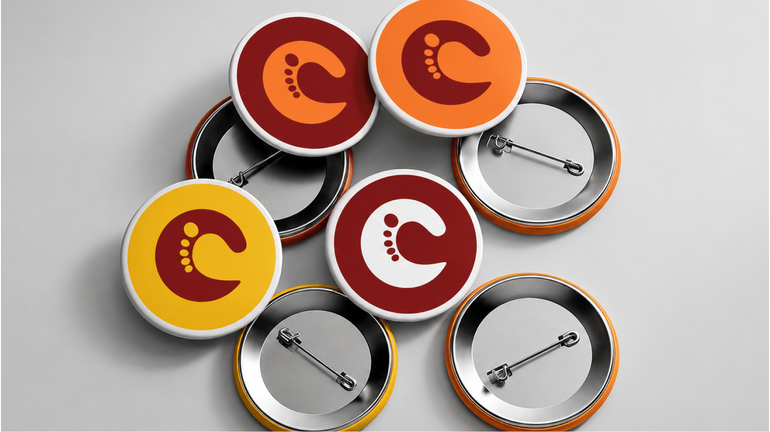
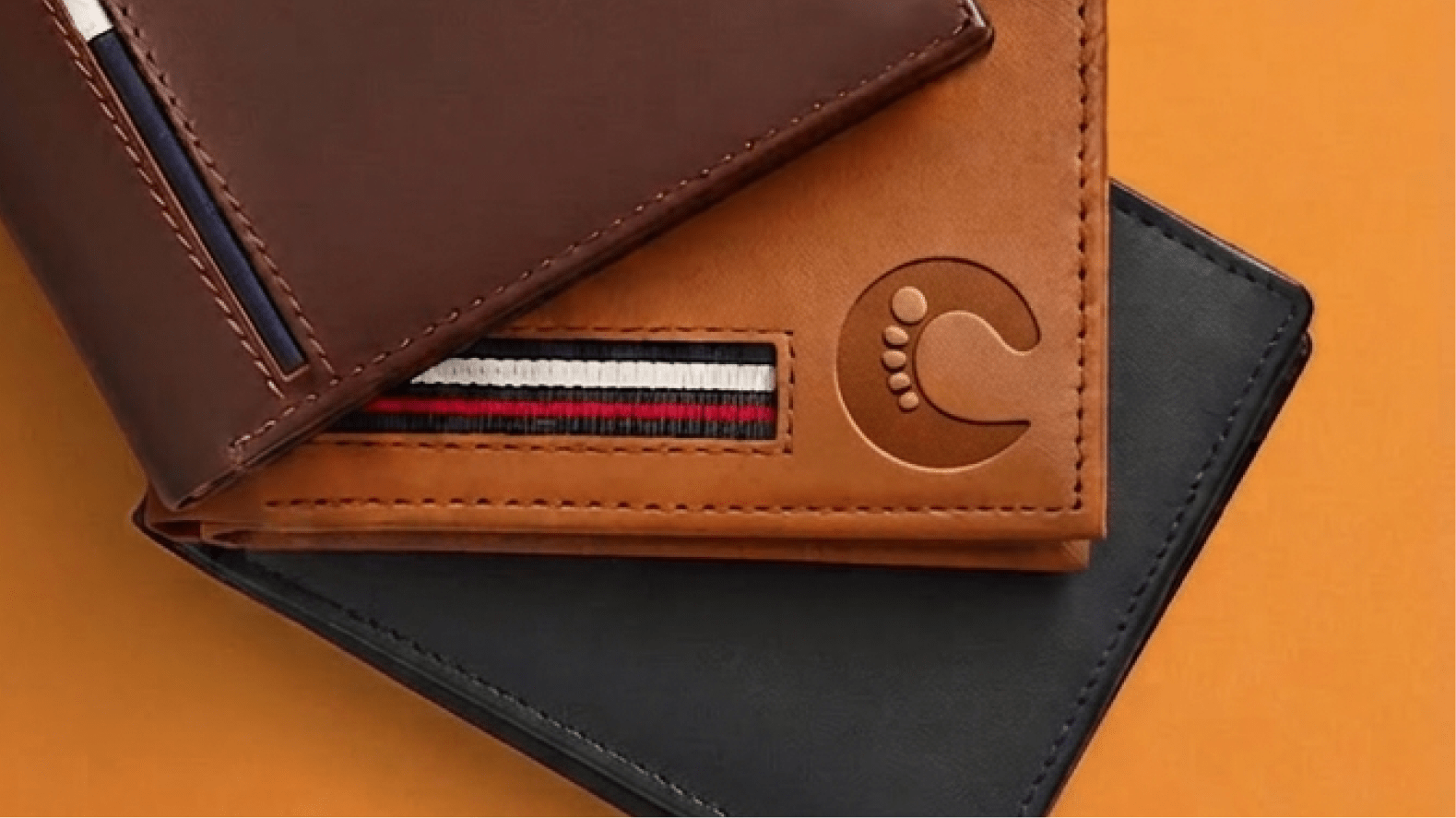
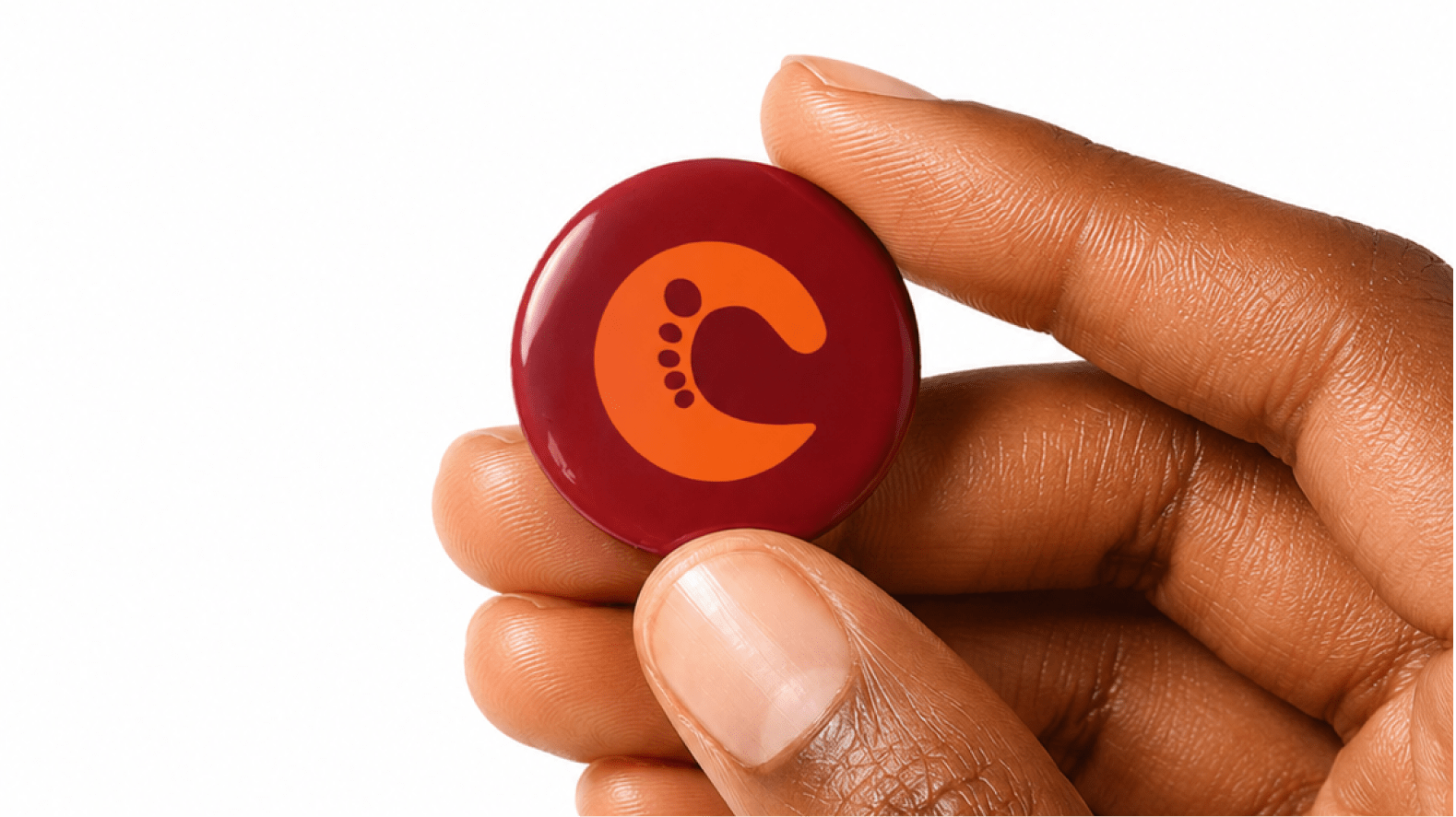
The icon begins as a bold C, but reveals something more the longer you look. The negative space subtly resembles a leg taking a step, while the rounded forms echo footprints left behind, transforming the logo from an initial into an action.
Movement becomes identity.
That same sense of movement carries through the wordmark. Rounded forms soften the typography, while its forward-leaning posture creates quiet momentum. Together, the identity feels like someone constantly moving forward, quietly reinforcing the brand's relationship with progress, confidence, and everyday movements.
Together, these elements create a symbol that feels simple enough to live comfortably on a shoe sole, leather stamp, swing tag, or social profile, while carrying enough meaning to become instantly recognisable.
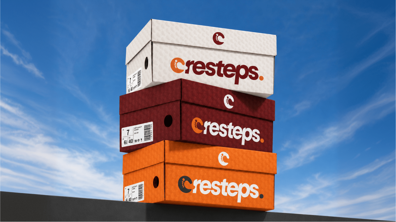
Bold, rounded letterforms communicate durability and craftsmanship, reflecting products designed to be worn repeatedly rather than replaced frequently. A slight forward lean introduces movement, echoing the act of stepping forward, while the custom integration of the icon into the opening letter gives the brand a distinct signature that cannot easily be separated from its identity.
The finishing period acts as a subtle declaration of completeness — exactly what a footwear should give to your fashion if carefully chosen.
Across the globe and especially in Nigeria, looking put together is more than just fashion. It's a statement!
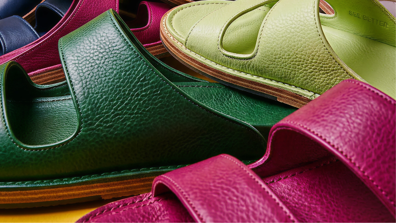
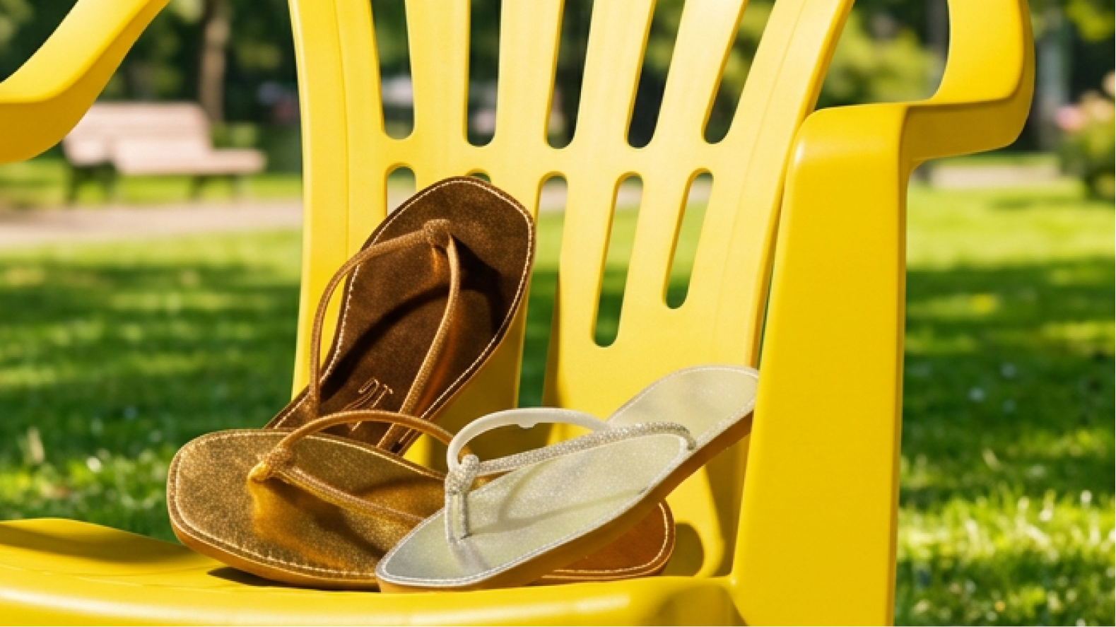
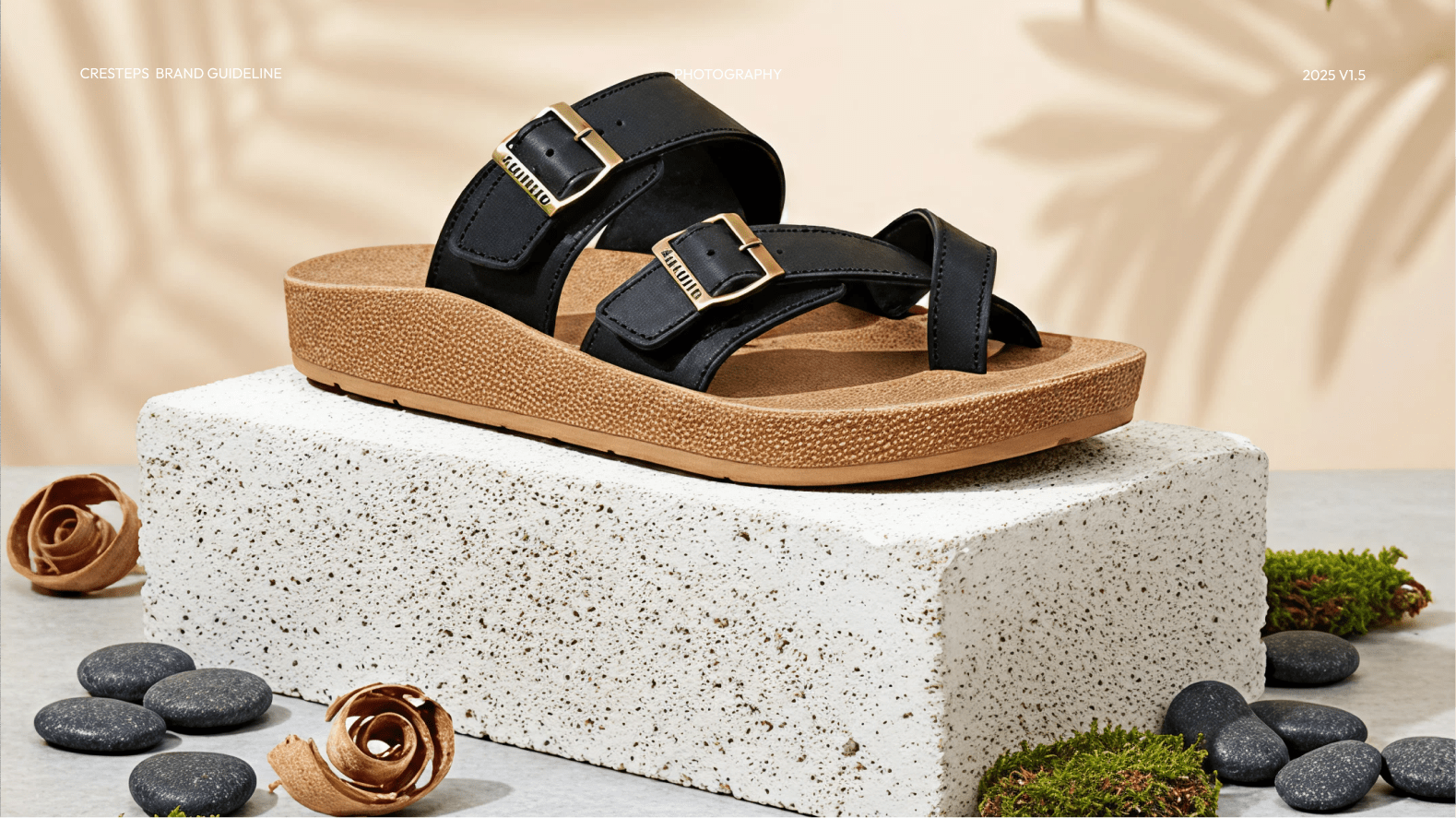
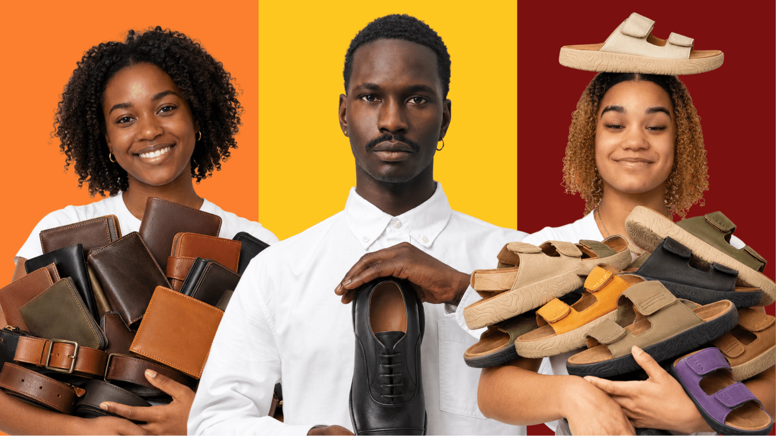
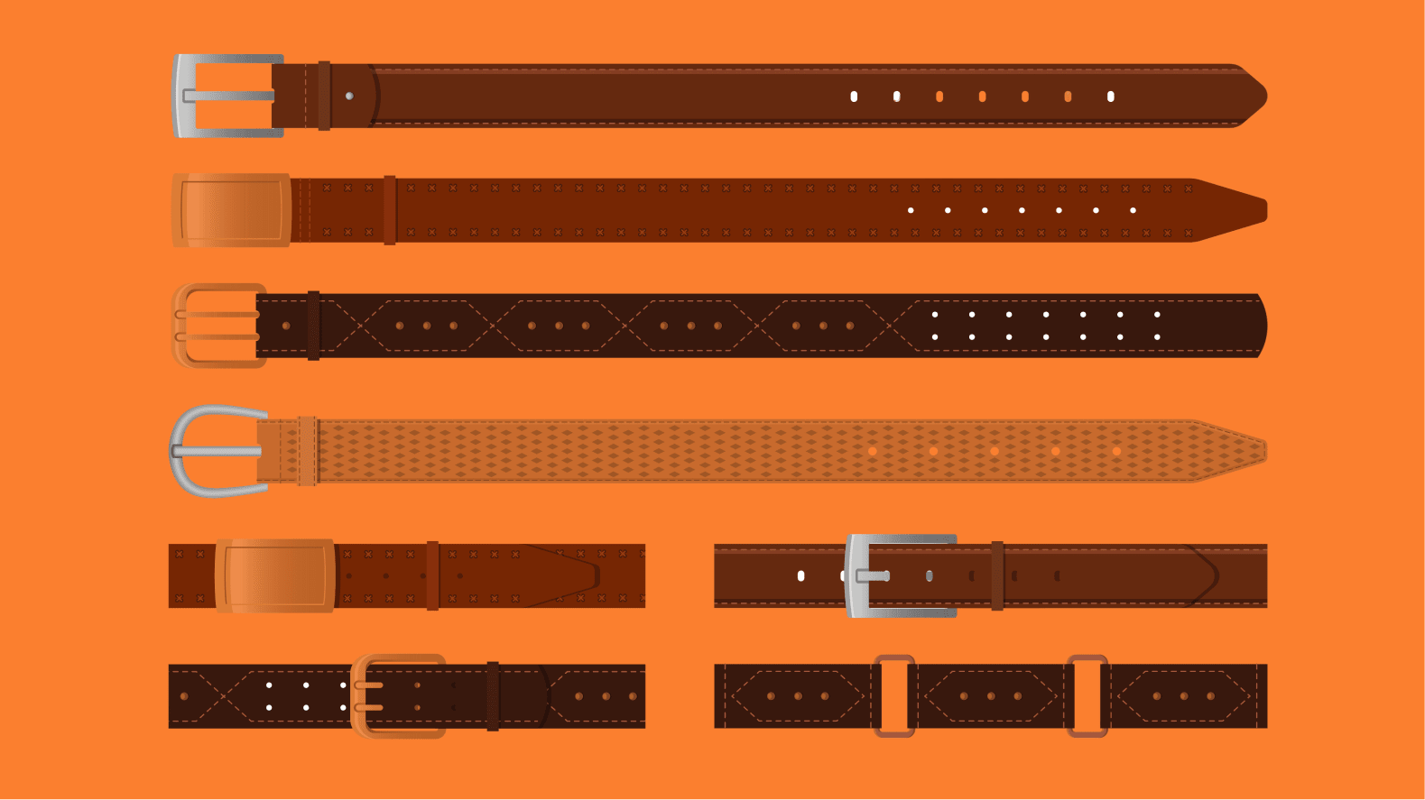
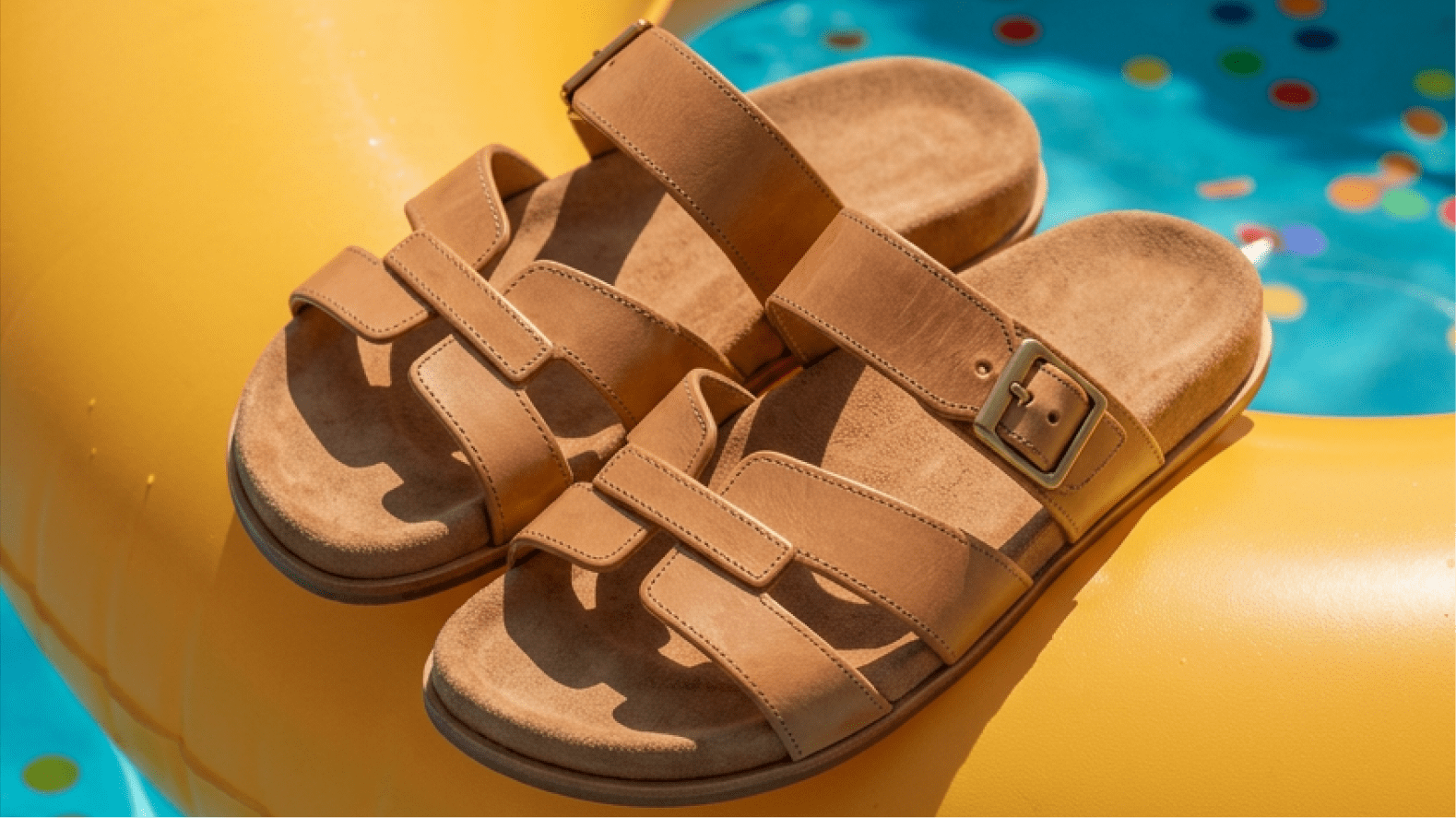
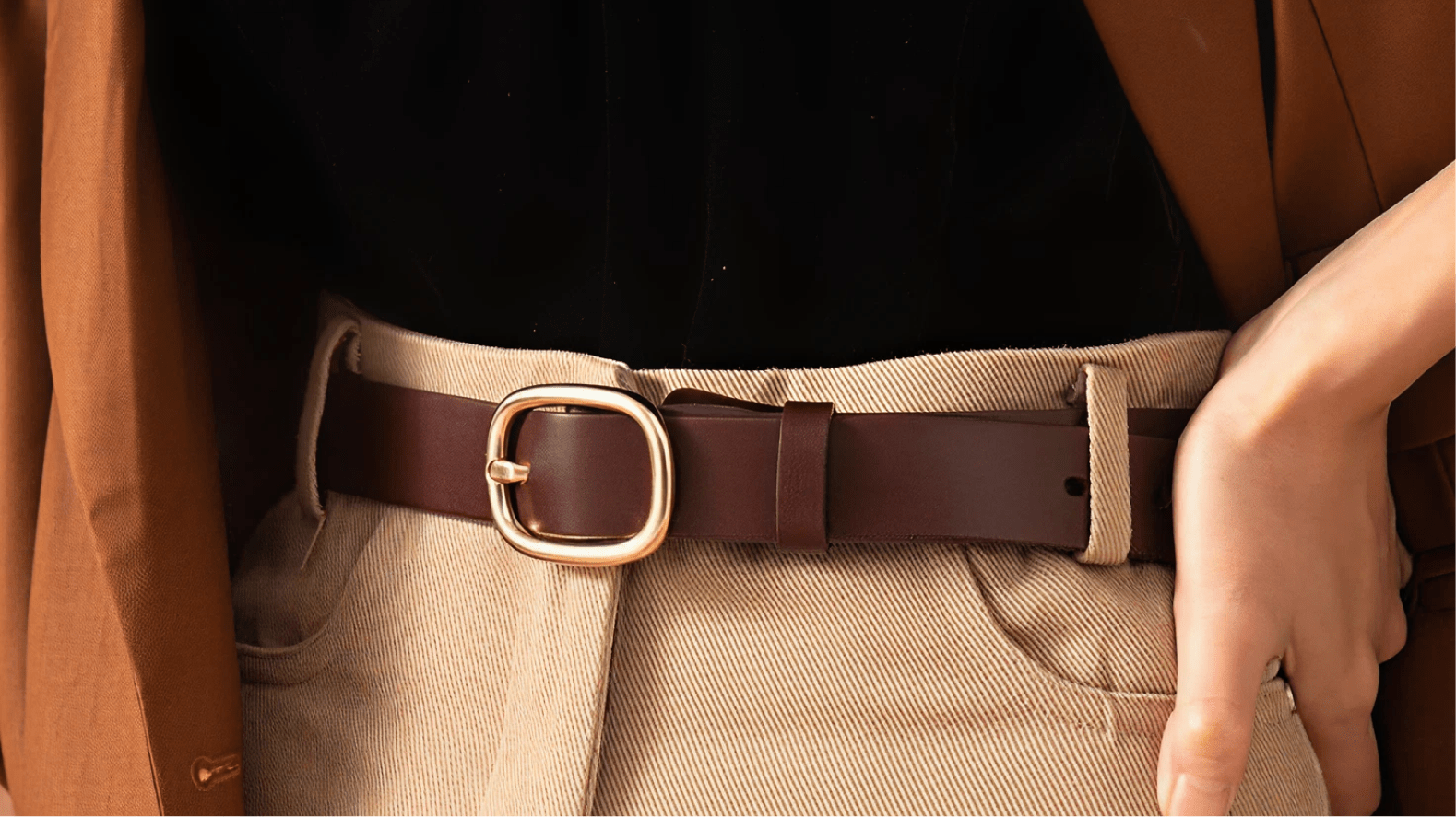
A polished pair of shoes often communicates discipline before conversation begins. A quality leather belt quietly completes an outfit. A handcrafted slipper becomes something worn not only at home, but proudly in social spaces. The smallest accessories often become the details people remember.
Our design system for Cresteps embraces this cultural understanding.
Rather than positioning leather goods as luxury objects reserved for special occasions, it celebrates intentional dressing as an everyday habit, recognising that confidence isn't built only during milestones.
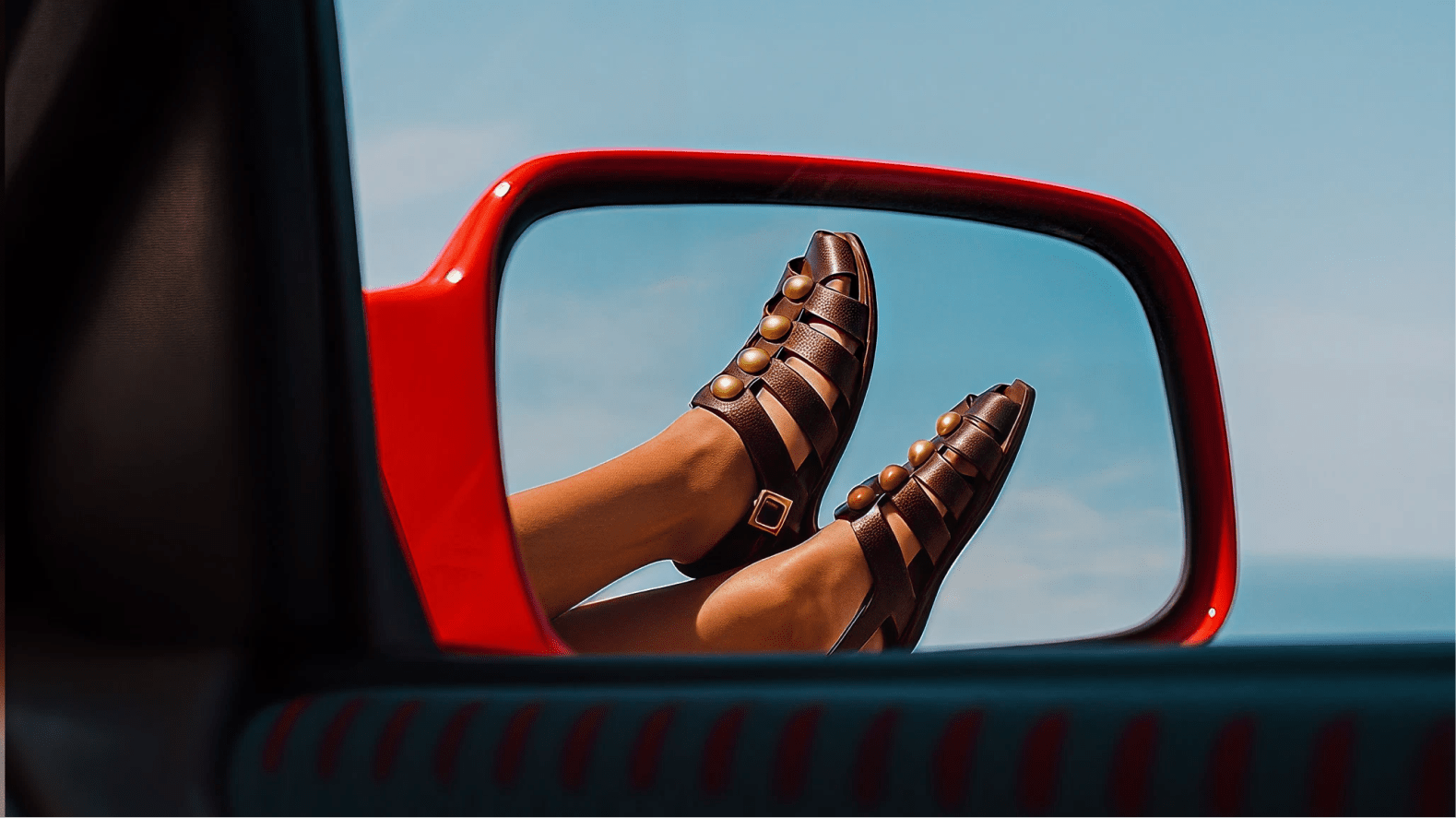
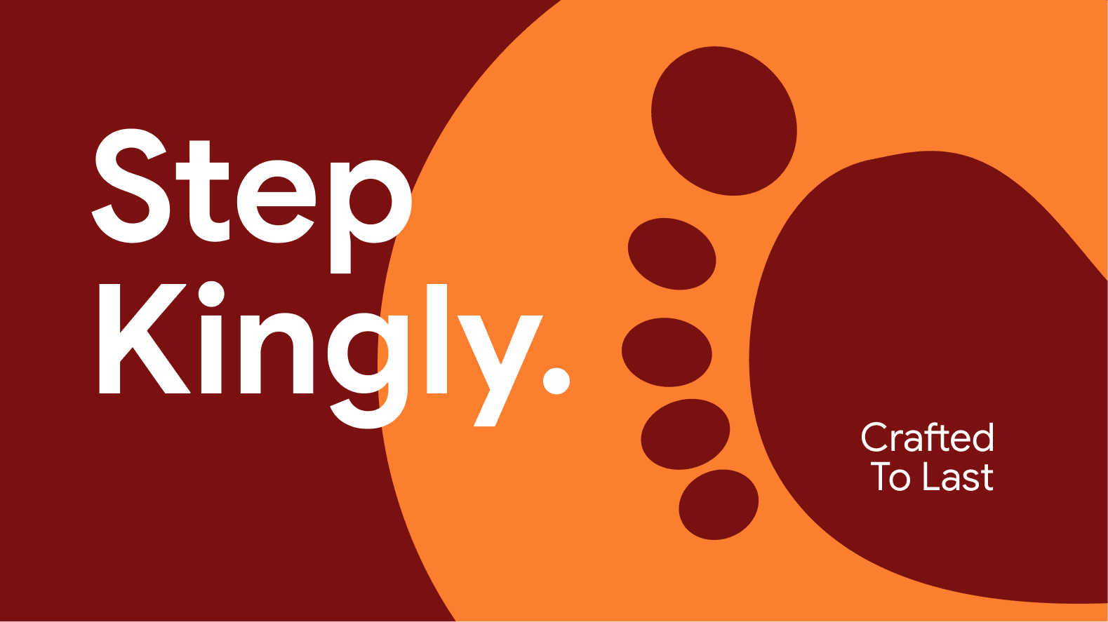
Style isn't just what you wear — and you should make every step worth noticing.
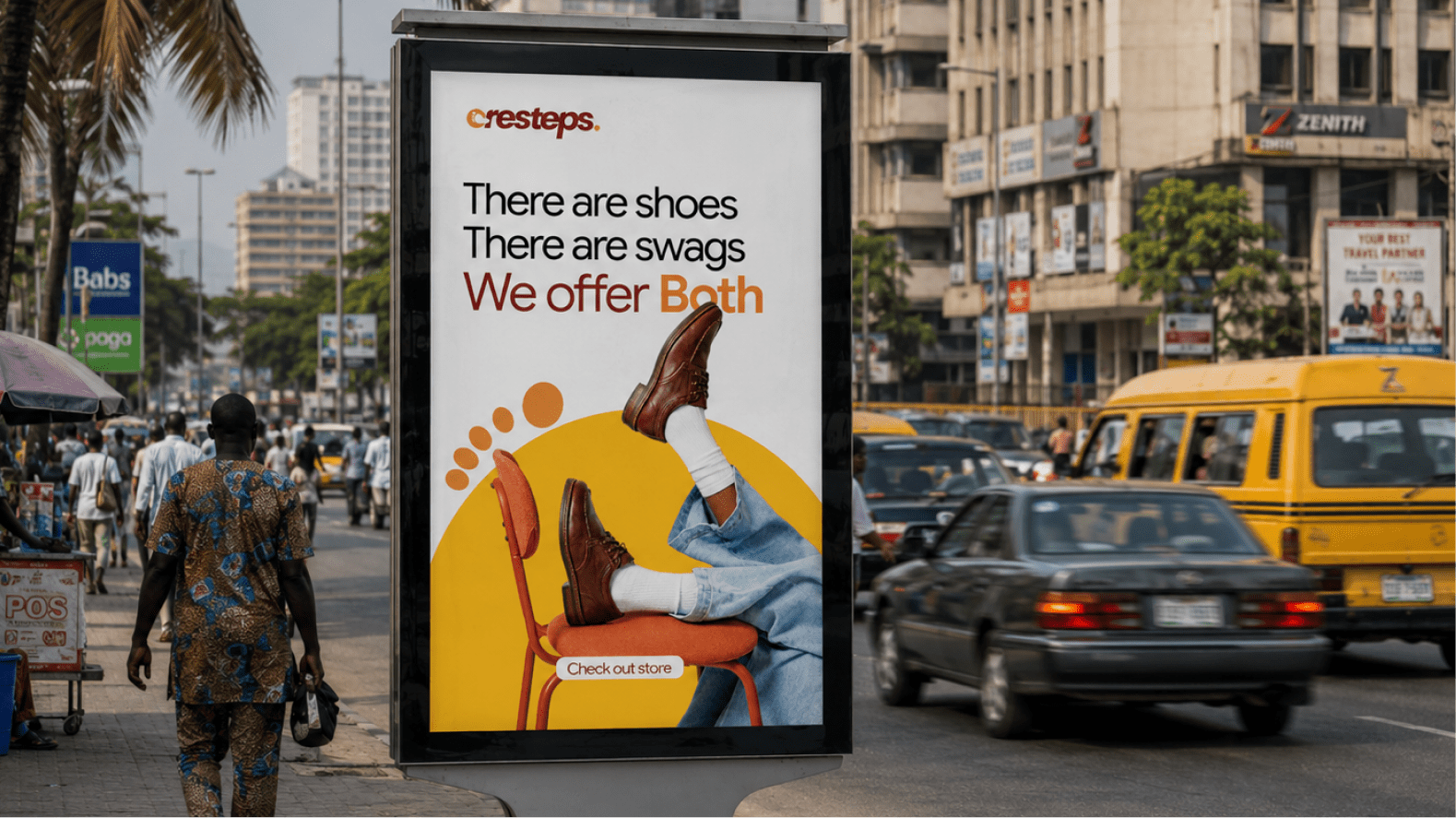
This idea extends naturally across the brand experience — from premium packaging and product stamps to shoe boxes, shopping bags, digital experiences, and social storytelling. Every touchpoint reinforces the same message.
The colour palette reflects the balance between energy and craftsmanship.
A vibrant orange gives the brand its optimism while burgundy gives it its depth. One speaks to creativity, movement and personality. The other reflects craftsmanship, maturity and leather that only gets better with time.
Together, the two colours create a visual language that feels both expressive and premium, allowing the brand to stand confidently across retail environments, packaging, and digital applications.
The typography follows the same philosophy. Bold enough to command attention. Rounded enough to remain approachable. Every curve reflects the balance Cresteps seeks in its products: strength without rigidity, confidence without noise.
Like the products themselves, the identity isn't trying to impress everyone. Only the people who understand that style is built one intentional step at a time.






Project Team
Paul Adegoke, Okiki Megida, Emmanuel Ayeni, Sodiq Ayilara
Contributors
Deborah Adeniyi
"Working with 1204Studios felt less like hiring an agency and more like building alongside people who genuinely cared about me and the vision behind Cresteps. They listened closely, challenged our thinking where it mattered, and brought clarity to ideas we had only been carrying around in our heads. I knew what I wanted Cresteps to stand for, but I wasn't sure how to express it visually. 1204Studios effortlessly showed me how!"
View all projects
Back to Portfolio